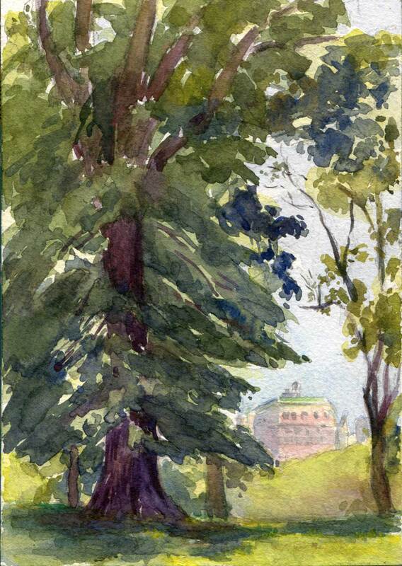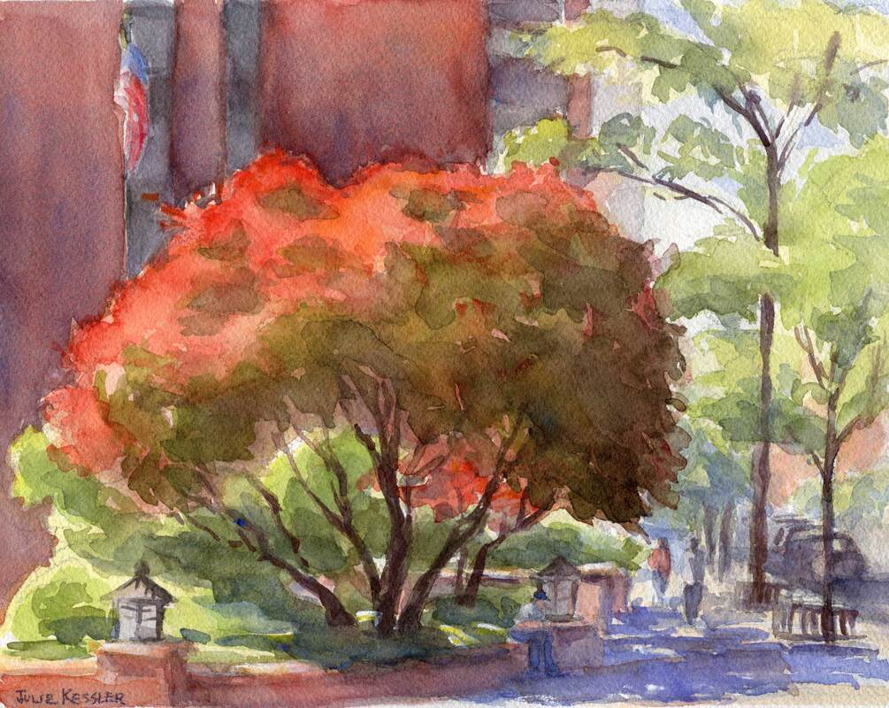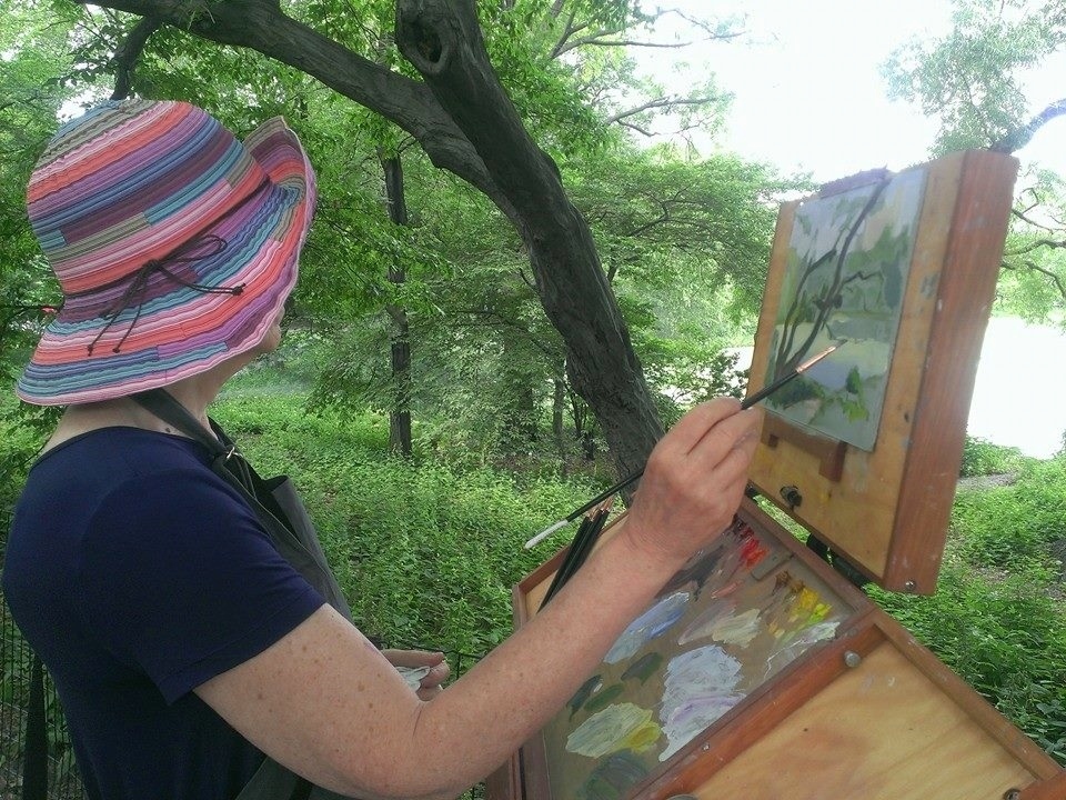
Art and painting have been the guiding star of my life. Sometimes other priorities pop up and take center stage. But even during complicated times my heart never strays far, and I still get some artwork in, if only in fits and starts.
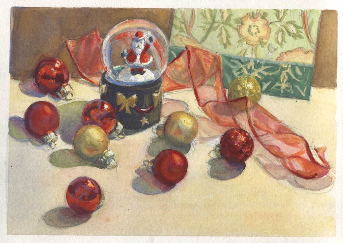
Recently I took out my gouache set and finished painting this year's holiday card. Too late to get it printed and mailed. But here's the good news: I'll be ready for next year!
Meanwhile: Whatever your beliefs or religion, and however you celebrate or don't, I wish you love and joy during the holiday season ... and beyond. Peace on earth and good will towards all,
Julie
Speak to me. I'd love to hear from you!
Click on the comment section below to add yours.
Click on the comment section below to add yours.