Julie Kessler Fine Art
  • Home
  • Galleries
  • On Paper
  • Oil Paintings
    • Landscapes
    • Still Lifes
  • About
  • Available
  • Contact
  • Blog

Touch of Pink

2/18/2021

2 Comments

 
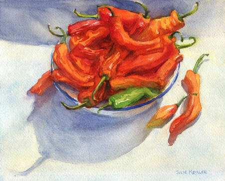
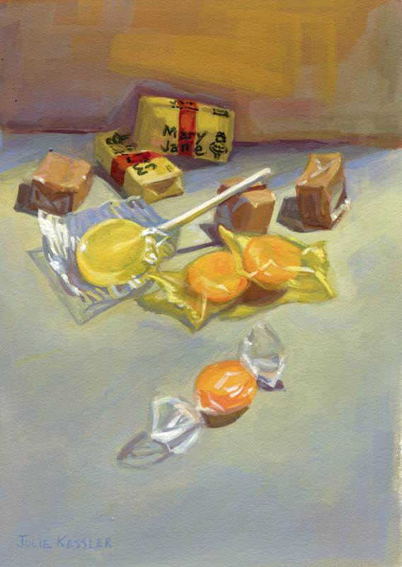
Mallomars! The chocolate cookie that's so much fun to paint. And since it's cold outside they're in season. And available right now at my local grocery store.

Though what I really wanted was another shot at that pink floral napkin. Yes, I love all the softness of the pinks against the crispy, dark cookies. But I have to confess, it's mainly because I love a good challenge. And for me, painting fabric in watercolor isn't easy. Especially patterned fabric. How come? Let me explain.
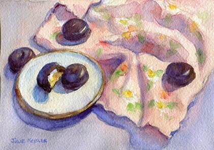
Picture
Mallomars No. 3
For Details or to Purchase

Well, one big challenge is in making the folds in the cloth look soft and rounded. Often there's a soft, subtle edge where a fold turns to the light, and a sharper, darker edge on its opposite side. A clean, moist brush will soften an edge, but just how moist is that? And since adding more water to the paint makes it lighter, I need to carefully gauge the ratio of paint to water for controlling lights and darks. All while choosing the right colors. And, as I make all these decisions, it's important to keep the paint moist and fresh, and not let it dry out. So the paint doesn't look blotchy. And the paper surface doesn't get wrecked. And the colors don't get muddy.

But wait, there's more! I also need to suggest the floral pattern, painting gingerly around the white flowers so they stay white. Why suggest? So each flower and leaf is just a little bit soft and hazy, without too much oomph. Otherwise the flowers will take over the whole painting and compete with the cookies for attention. After all, this painting is called "Mallomars, No. 3", and not "Floral Napkin with Mallomars"!

And, with all these different colors in the pattern and the folds and the lights and shadows, and keeping the white flowers white, pant, pant ... the napkin still has to read as a pretty, delicate pink.

Yes, it's a lot for a novice watercolorist! It's one thing to understand all this in theory, and quite another to actually do it. There's only one way to learn how to paint with beautiful, confident brushstrokes: Practice, practice, practice. I'm workin' on it.

I'd love to hear from you!
Click on the comment section below to add your questions and comments.

SUBSCRIBE
INSTAGRAM

2 Comments

Autumn Fruit

11/25/2020

0 Comments

 
I'm a painter, and never intended to write a food blog. But since fruits and vegetables are so beautiful to look at I often wind up using them in my still life paintings. Right now the grocery stores around here are stocked with mandarin oranges and hachiya persimmons, two gorgeous fruits that originated in Asia. Every autumn I look out for them because they make such wonderful subjects to paint.
Picture
Mandarin Oranges, No. 1
For Details or to Purchase

Mandarin oranges are deliciously sweet and come in several varieties. A quick internet search revealed that these particular mandarins are called satsumas. Fortunately for me satsuma oranges are shipped with stems and leaves still attached. This protects the oranges and makes them more fun to paint. ☺️

I purposely tried to keep the edges as wet and soft as I could. My aim was to use sharper edges only where absolutely necessary. So you could tell that I was painting oranges and leaves, and not just puddles of pretty colors. This soft method takes advantage of the flowing, watery nature of the watercolor medium. And is a continual source of learning and experimentation for an artist who started out as an oil painter.
Picture
Hachiya Persimmons in Silver Bowl
For Details or to Purchase

Persimmons also come in varieties. The two most commonly sold in New York City are fuyus and hachiyas. Fuyus are the flat round ones, sweet and ripe while still firm. I painted the other type, hachiya persimmons. Hachiyas have pointed ends like acorns, and need to get good and soft before you can eat them. Otherwise they're quite astringent and can make your mouth pucker, blech!

My persimmons had reached the ripe, delicious stage. I put the lovely orange-red fruits in a silver bowl, and placed them on a patterned fabric to create an interesting reflection.  But I didn't want that beautiful, busy fabric to take over the whole painting. So I muted the patterns by keeping their edges soft. And I upped the contrast, details, and color intensity in the fruit. That's how my luscious persimmons hold your attention and remain as the center of interest.

Thanks for visiting!

I'd love to hear from you!
Click on the comment section below to add your questions and comments. ​

Follow me!
SUBSCRIBE
INSTAGRAM
0 Comments

In the Bedroom

10/21/2020

6 Comments

 
The bedroom. The place where people sleep. In western culture it's an intimate room often tucked away in a private area of the house. Artists have been painting them for ages. But in my search for images I found mostly erotic and religious works that happen to take place there. It was much harder to find paintings that were all about the bedrooms themselves. Until I got to the 19th century. So what changed?
Picture
Vincent van Gogh, The Bedroom, 1888, Van Gogh Museum, Amsterdam
Well, prior to the 19th century western painters made a living by making art for the one percent of their day. And what did the wealthy want? Mostly portraits of themselves, and art with religious, mythological and historical themes. Along with the occasional naughty picture commissioned for their own unofficial and secret enjoyment.
Picture
Edouard Vuillard, Child Playing: Annette Roussel in a Front of a Wooden Chair, c1900, Art Institute of Chicago
But then came the industrial age, and with it the growth of the middle class. Artists found new buyers who were interested in a whole 'nother type of art. Basically their new clients wanted nice paintings to hang on their walls, and were uninterested in large formal paintings with a religious or complicated  message.
Picture
Carl Larsson, Papa's Room, c. 1890-1899, Nationalmuseum, Stockholm
Technology brought major changes for artists too. Photography, a new invention, became a  popular source for portraits. New tools, like collapsible paint tubes and portable easels catapulted painters out of the studio and into the great outdoors. Discoveries of bright new pigments opened their eyes to the brilliant world of light and color. Freed from former constraints, artists began experimenting with their shiny new toys. And looking to their own, personal experiences and immediate surroundings for inspiration.
Picture
John Singer Sargent, Bedroom Window, c. 1909-1911
Why was I interested in bedroom paintings in the first place? Well, as you know there's a pandemic on right now. I was looking for inspiration without leaving the house. This couldn't be the first time artists encountered rainy days or pandemics. I wanted to see how they made the best of being stuck inside. 

Do you paint interiors? Have you got a favorite artist who did? Or a favorite painting of one? Do tell us in the comment section below.
Picture
Julie Kessler, Bedroom, Watercolor, 8x10 in

I'd love to hear from you!
Click on the comment section below to add your questions and comments. ​

Follow me!
Facebook   Instagram  Subscribe
6 Comments

Pepper Pops!

10/14/2020

0 Comments

 
Red is quite a fiery, flashy color, isn't it? It likes to jump up and down and wave for attention. It monopolizes all eyes in the room. Too many flashy colors in your painting and it could escalate into a brawl. Although I adore them I rarely place such flaming colors so prominently in my paintings. Usually I save them for a few bright accents just to liven things up. That didn't happen this time.

It was full harvest mode at my local farmer's market. Amid all the produce was a dazzling assortment of peppers in yellows, oranges, reds and greens. All these gorgeous colors caught my eye, so I brought a box home to paint in a still life. I arranged some orange and green peppers in a bowl with a few red ones scattered about for a bright color pop. Frankly, my first attempt was not a success. (Hey, it happens. All the time, actually, and thereby lies a tale for another post.)

When I finally got around to the second try the peppers had ripened into a full blazing scarlet. Not my original intention, but what can you do. An artist has to adapt. Anyway, that red was such a rich, ravishing color that I went for it. I'm a sucker for a challenge. But how to make it work with all that heat? I thought that by surrounding the reds with some cool grays and blues it might calm the composition down a bit. And allow the reds to shine. And that it might be fun to contrast them with that one lone green pepper that refused to ripen. 
Picture
Red Peppers in Bowl
For Details or to Purchase

For the next painting I went back to my usual m.o. with a gentler color scheme. And some brilliant color pops. Back at the market I picked up another box of peppers. Orange ones.  This time the red accents were in the leaves of a croton plant sitting by the window. It was a dark, rainy day and I loved the way the soft, cool grays played against the vivid reds and oranges in my peppers and leaves, setting them off nicely. 
Picture
Peppers and Croton Plant
For Details or to Purchase

I'd love to hear from you!
Click on the comment section below to add your questions and comments. ​

​​Follow me!
Instagram   Subscribe
0 Comments

On the Waterfront

10/3/2019

2 Comments

 
Picture
Christopher Street - Pier 45, Watercolor on Paper, 8x10 in
Two watercolors I painted at two waterfront parks in Manhattan. I painted them in May and have only now got around to posting them. Looking at these paintings I can still remember the thrilling sense of freedom when winter ends and it's finally warm enough to paint outside. Sort of how kids feel when June comes around and school is out for summer. Yippee!
Picture
Circle Line - Pier 85, Watercolor on Paper, 8x10 in
What I got down on my paper doesn't completely match what I had in mind when I first spotted these two spectacular views on the piers. Don't get me wrong, I'm not unhappy with them! But the results are  an approximation and a surprise. I'm still pretty new to watercolor, and In these paintings I concentrated on experiments with washes and dry brush techniques. I didn't know how they would turn out. Of course, an artist who wants to grow never stops experimenting and learning. After all, we're always inventing ways to interpret a three dimensional world in a two dimensional medium. Not only that, but we've only got a finite number of pigments to describe all the infinite and dazzling colors of nature. So we're always reaching. And then reaching for more. And so it goes. 

Follow me!
Facebook   Instagram  Email
2 Comments

Madison Square Park

9/21/2018

7 Comments

 
Picture
Madison Square Park - Fountain, 8x10 in, Watercolor w/ Gouache on Paper
This was a complicated subject and frankly I was a little intimidated by it. Since I'm relatively new to watercolor, I wondered how I could possibly preserve the tiny white flowers in the planter and the skinny little sprays of water in the fountain ... when there was a whole forest of trees standing right behind them. Well, the answer is: I didn't.

Actually I take that back, I did, a little. With negative painting. That is, instead of painting the sprays of water directly I painted everything around them and left the paper white where the sprays went. After everything dried I used a wee bit of white gouache* on top for extra oomph. However, I didn't have the patience to paint around every single itty-bitty white flower in the planter. So first I painted the foliage and let it dry. Then I laid in the flowers with gouache right on top. I even used gouache to lighten up some of the foliage in front. Hey, Homer and Sargent did this all the time. So I guess it's all right!

*(Gouache is an opaque water-based paint, so it can be used to paint light colors over dark. Unlike watercolor, which is transparent.)


Want new posts in your inbox? Click here

​< Model Boat Pond - Central Park          All Posts         Rainy Daze >
7 Comments

Unisphere

10/16/2017

1 Comment

 
Picture
Unisphere - Flushing Meadows Corona Park, 5x7 in, Watercolor on Paper
Watercolor is a gorgeous, magical medium. But until recently I never learned how to use it. Frankly I was intimidated. Why? Because I was trained in oil painting, which is an opaque medium. With oil paints if you make a mistake you can paint right over it. Or easily wipe it off and start again. That's why my adventure in water paints began with gouache, which is a kind of "starter" medium for oil painters. Gouache is opaque, and like oil paint there's wiggle room for painting over serious flubs. Whereas the transparent nature of watercolor means there's only so much "adjusting" you can do. Sure, you can lift the paint off a little. But once you've put a stroke down on paper you're pretty much stuck with it. 

And that's not all. With watercolor you need to plan where your light areas and highlights will go -- way before you even begin painting. Once you put down a dark color you can forget about painting over it with a light one. The dark colors underneath will show right through. Because hey, they're transparent, right? (Although there are a few tricks that help in recovering your lights if you do happen to forget them. Like using white gouache. Purists won't touch the stuff, but many great watercolorists did, including John Singer Sargent himself.)

So, you may ask, with all these complications, why not just stick to gouache? Well, gouache is a beautiful medium, it's true. But even so, it has somewhat of a chalky look to it. Unlike watercolor, whose transparency gives the colors a special brilliance and luminosity. And who doesn't lust after gorgeous, luminous colors? Well then.

Okay, so it was time to try out my brand new watercolor set. I brought it along last week when I met up with another artist pal in Queens. We decided to check out Flushing Meadows Corona Park, at the site of the old 1964 World's Fair. And there it was, the Unisphere! Shining brightly in the afternoon sunlight. Commissioned to celebrate the dawn of the space age and the fair's theme of "Peace Through Understanding."  What a beautiful globe and a wonderful theme. A theme that is still so significant in these contentious times. Definitely worth sketching! 

Want new posts in your inbox? Click here

​< Out and About with Urban Sketchers          All Posts          ​Satsuma Oranges >
1 Comment

Drawing Under the Elms

7/11/2017

0 Comments

 
Picture
Faber Castell - Albrecht Durer Watercolor Pencils
 'Twas a long, busy spring ... with not enough time for making art, let alone blogging about it. Sad. But I'm back. And all kitted up with a brand new box of Faber Castell - Albrecht Durer watercolor pencils, wheeeeee! Aren't they gorgeous?

The colors are rich and beautiful when you draw with them like regular colored pencils. But the color really pops once you brush them with water. Of course I wish I had more (and more and more) colors. And I'll probably get them eventually. But so far I'm loving this nifty assortment of thirty-six. 
Picture
Under the Elm Tree, Central Park, 5x7 in, Watercolor Pencil on Paper
Couldn't wait to try them! So on a hot summer afternoon I took them out for a walk in Central Park. Where I found a cool spot in the shade of this wonderful old American elm tree. 

Want new posts in your inbox? Click here

​< Mallomar Season          All Posts          ​Out and About with Urban Sketchers>
0 Comments

Valentine's Day

2/13/2017

2 Comments

 
Picture
François Boucher, The Wooden Shoes, 1768
Valentine's Day. Let's celebrate by taking a peek at the amorous whipped cream confections of French Rococo painter François Boucher (1703-1770). A fashionable artist in King Louis XV's court, he had a playful, sensuous style that was sentimental and often quite erotic.

Some critics find Boucher's work superficial and vacuous - an expression of the decadent “One Percent” of his time. Well, they've got me there. But all the same, I surrender to the seduction of his luscious, liquid brushstrokes. Not to mention the sheer pleasure of gazing at his bubbly ribbons and bows. And creamy pinks and baby blues. Yes, even the “99 Percent” can enjoy a bit of dessert now and then.

Picture
François Boucher, Hercules and Omphale, 1734
Picture
François Boucher, Spring Anagoria, 1755
Picture
François Boucher, Venus Consoling Love, 1751
Picture
François Boucher, Lovers in a Park, 1758
Picture
François Boucher, Diana and Callisto, 1759

Want new posts in your inbox? Click here

< Fashion Week          All Posts          ​Mallomar Season >
2 Comments

Penny Candy

8/6/2016

2 Comments

 
Picture
Penny Candy, 5x7 in, Gouache on Paper
Summer is one of my favorite seasons, because it's great fun to draw and paint outdoors. But there's hot weather, and then there's HOT weather. And last week New York City was so hot and sticky that I decided to paint indoors. Fortunately I keep a bag of penny candy around for still life emergencies. 

I love painting shiny, transparent wrappers, and penny candies are perfect for that. But they can also present problems. Because candy colors are quite intense, and if you're not careful the painting can become loud and garish. So I decided to stay mainly with yellows and oranges. And I threw in a few soft brown caramels to tone them down a bit. 
< Hot Sauce & Limes          All Posts          ​​August >
2 Comments
<<Previous
    Julie Painting

    Julie Kessler

    I'm a representational painter enchanted by the unique qualities of watercolor. Sometimes oils, gouache, colored pencils and other media call to me too. I started this blog to share my work and ideas about making art. Sometimes I toss other things into the mix. Such as painters I love, and art books and exhibits that inspire me. Your comments are welcome. I'd love to hear from you! 


    Follow Here!
    Instagram
    Subscribe!

    Recent Posts

    Picture
    Central Park Trees
    Picture
    Central Park Grad
    Picture
    Singer 66 Red Eye

    Categories

    All
    Art History
    Books & Videos
    Boucher
    Central Park
    Cityscapes
    Color
    Colored Pencils
    Composition
    DIY
    Drawing
    Exhibits
    Friskit
    Gouache
    Hispanic Society
    Interiors
    Introduction
    Julie's Drawings
    Julie's Paintings
    Landscape Painting
    Manet
    Metropolitan Museum Of Art
    Oil Paintings
    Pen And Wash
    Portraits
    Sam Adoquei
    Sorolla
    Still Life
    Theo Fried
    Thomas Hart Benton
    Veronese
    Watercolor Pencils
    Watercolors


    www.juliekessler.com
 HOME   GALLERIES   ON PAPER   OIL PAINTINGS  AVAILABLE  ABOUT   CONTACT   BLOG
Follow:  Instagram  Subscribe
www.juliekessler.com  All images © Julie Kessler, all rights reserved