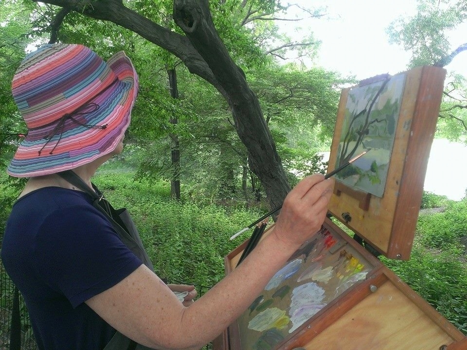
If you read my last post you'll know that I'm taking a Central Park landscape class during the month of June. After a year of staying in place it's so liberating to be out and about with other people who love making art as much as I do. And in such a gorgeous setting! Not only that, our teacher, Sam Adoquei is a monumental source of knowledge, heart and skill. I'm thrilled that he's teaching the tools that will make my work stronger. And potentially more beautiful.
For an artist there are a million things to study. In this class my focus has been on the essential rules of composition. After all, no matter how well I paint, or how lovely my brushwork and colors are, if my design stinks then nobody will be interested in my work. A sobering thought. And high motivation to master this fundamental lesson.
For an artist there are a million things to study. In this class my focus has been on the essential rules of composition. After all, no matter how well I paint, or how lovely my brushwork and colors are, if my design stinks then nobody will be interested in my work. A sobering thought. And high motivation to master this fundamental lesson.
Like Mr. McGuire's famous advice in "The Graduate", during the class Sam shined the spotlight on one single word. But in this case that word was BALANCE.
Yes, balance is the secret password to great design. Especially asymmetrical balance created by things that are dissimilar. Here are three simple examples of this principle: If you have a large object in your painting balance it with a few smaller ones. Or if you paint something round and smooth you might balance it with some short sharp lines. Or balance dull colors with a few bright ones. You get the idea. All the very best paintings, both modern and traditional, are based on this concept.
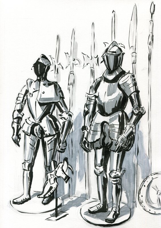
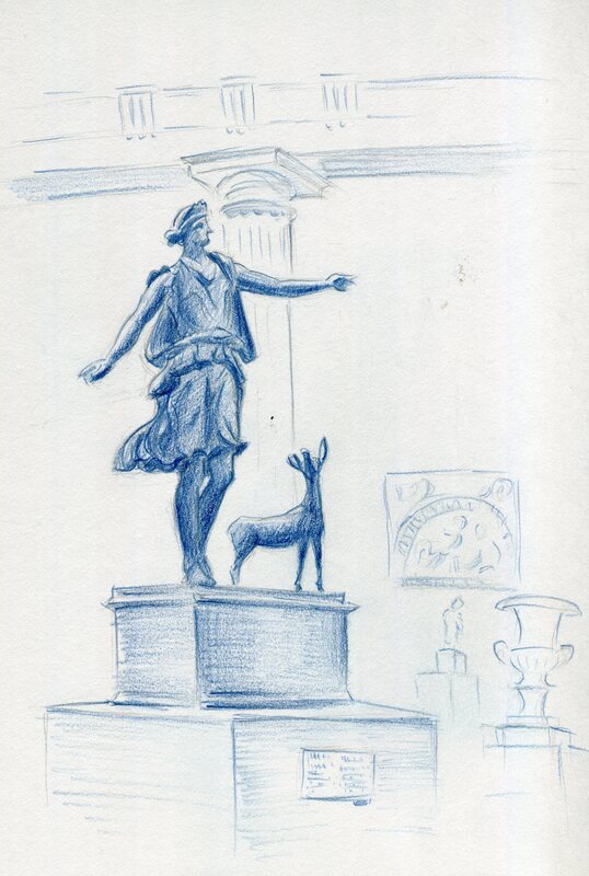
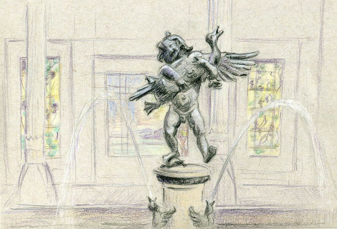
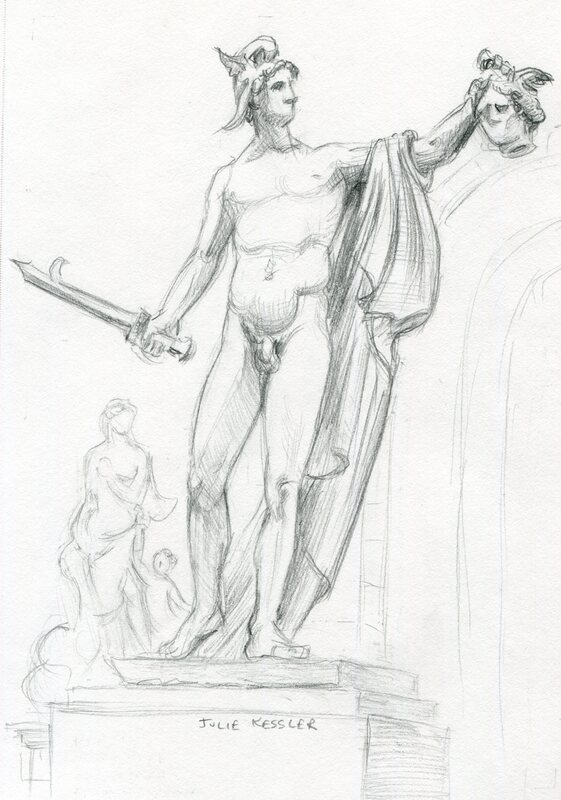
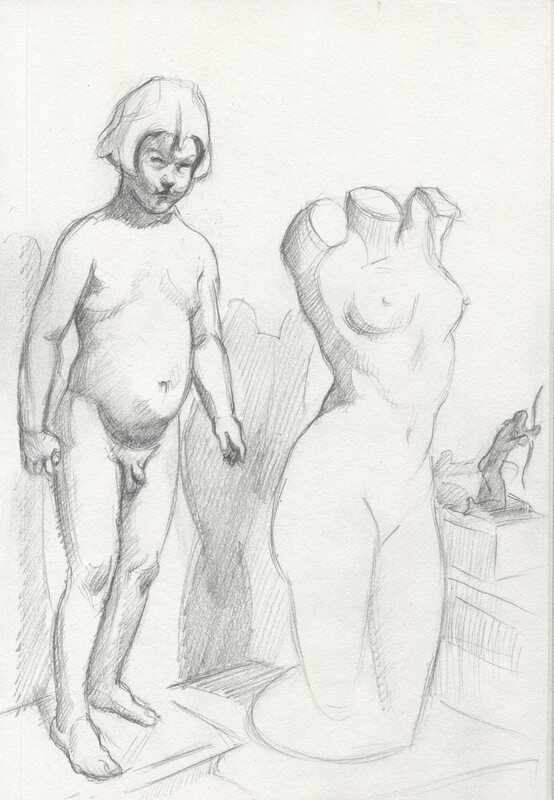
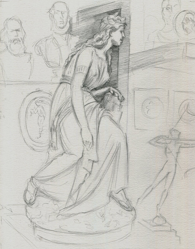
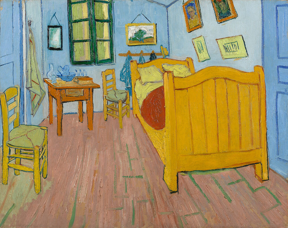
As the class began I spent quite a few days practicing balance with value. In art value is how light or dark things are. In the pencil studies below I used only three values: light, medium and dark. For each study my assignment was to choose one of the three values, using it as the dominant one in roughly 75 percent of the sketch. I placed the other two values in the remaining area, about twenty and five percent respectively. All this while making sure that there was at least one large, dominant shape.
For me this was an easy concept to understand. And like so many things in life it was a bit trickier to execute. I'm glad these sketches were fun to do, because I did a whole lot of them (smile). And I'll probably continue to make quick pencil studies before beginning a painting, even after the class is over. Turns out these little sketches are quite handy for solving big problems before committing to a larger work.
Yes, balance is the secret password to great design. Especially asymmetrical balance created by things that are dissimilar. Here are three simple examples of this principle: If you have a large object in your painting balance it with a few smaller ones. Or if you paint something round and smooth you might balance it with some short sharp lines. Or balance dull colors with a few bright ones. You get the idea. All the very best paintings, both modern and traditional, are based on this concept.
As the class began I spent quite a few days practicing balance with value. In art value is how light or dark things are. In the pencil studies below I used only three values: light, medium and dark. For each study my assignment was to choose one of the three values, using it as the dominant one in roughly 75 percent of the sketch. I placed the other two values in the remaining area, about twenty and five percent respectively. All this while making sure that there was at least one large, dominant shape.
For me this was an easy concept to understand. And like so many things in life it was a bit trickier to execute. I'm glad these sketches were fun to do, because I did a whole lot of them (smile). And I'll probably continue to make quick pencil studies before beginning a painting, even after the class is over. Turns out these little sketches are quite handy for solving big problems before committing to a larger work.
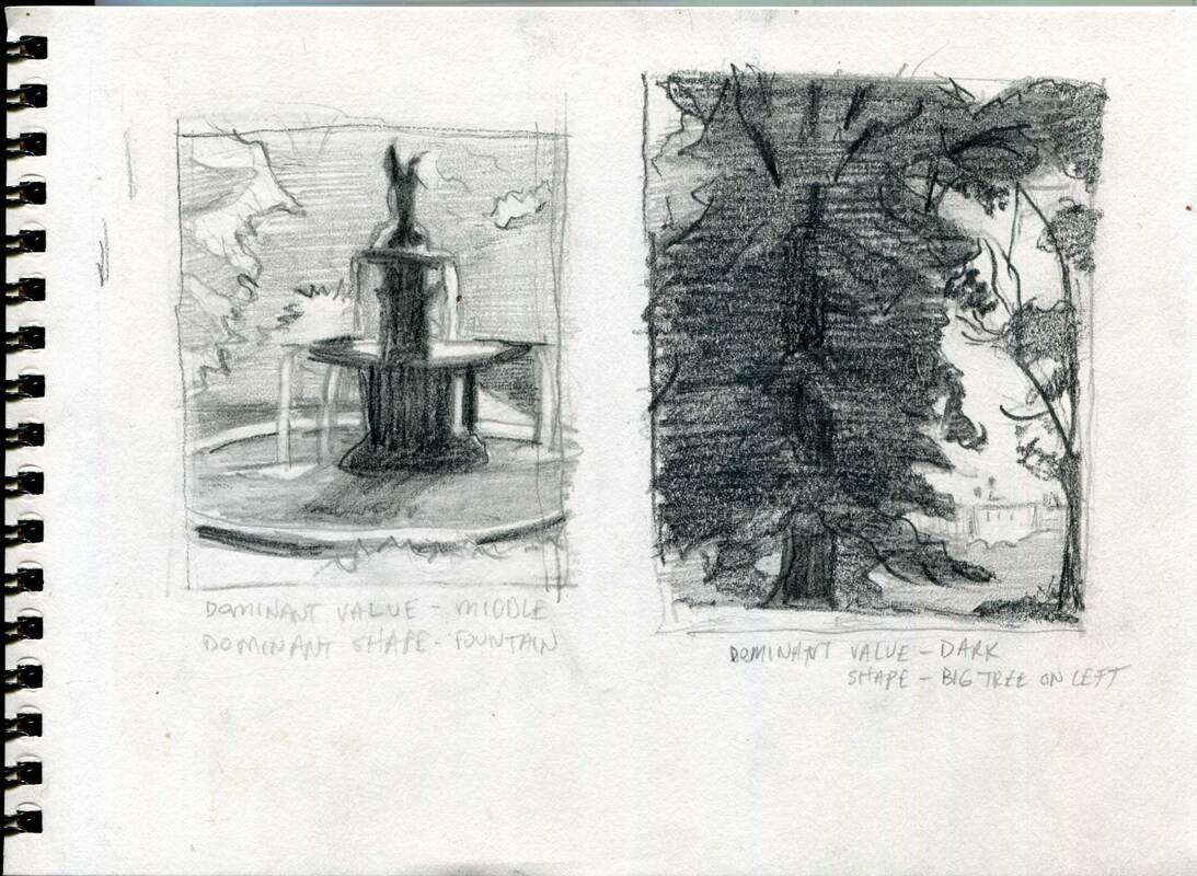
Central Park Composition Studies (1), Pencil.
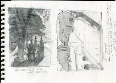
Central Park Composition Studies (2), Pencil.
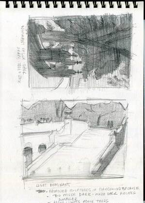
Central Park Composition Studies (3), Pencil.
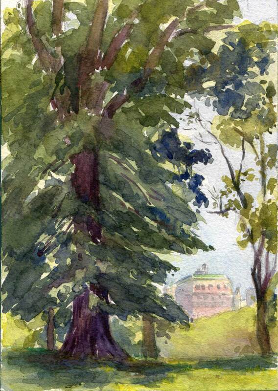
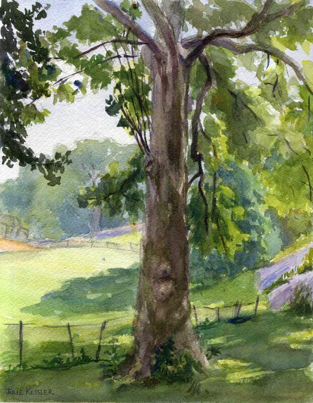
Central Park Tree Looking West, 5x7" Watercolor
If you take a look at the second sketch on the first page of pencil sketches above you'll see the study I used as the basis for my watercolor, Central Park Tree Looking West. Let's see if I managed to maintain a sense of balance in the design. Seventy-five percent dark in value? Check. One large dominant shape? Check. And there were several other things to balance too. For instance the tall, stately tree on the left with the smaller, delicate one on the right. And the trees representing the vastness of nature compared with the tiny man-made Central Park West building in the background.
What a great class, right? It's given me so much food for thought as I plan my paintings in the future. Hope you've enjoyed reading about my experience. Please let me know what you think in the comments!
What a great class, right? It's given me so much food for thought as I plan my paintings in the future. Hope you've enjoyed reading about my experience. Please let me know what you think in the comments!
Speak to me! I'd love to hear from you ...
Click on the comment section below and add your questions and comments.
Click on the comment section below and add your questions and comments.