Julie Kessler Fine Art
  • Home
  • Galleries
  • On Paper
  • Oil Paintings
    • Landscapes
    • Still Lifes
  • About
  • Available
  • Contact
  • Blog

Central Park Grad

7/6/2021

1 Comment

 
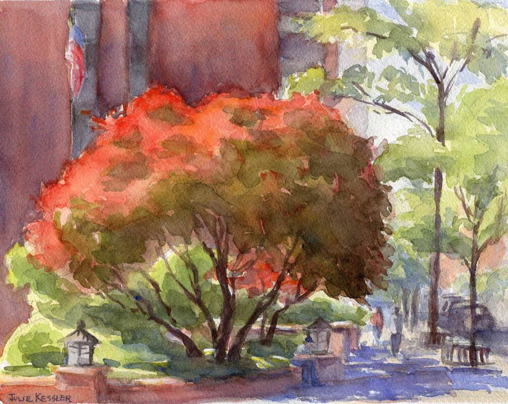
Ah, tempus fugit, and that wonderful Central Park landscape class I've been taking is now officially over. Luckily I still have a season ticket to al fresco painting in New York City. And time to practice all the great new stuff I learned in the class. But summer marches on, so I hope the weather gremlins behave themselves. Gotta get out there and paint!
Picture
Central Park Tree Looking West, 5x7" Watercolor

Hmmm, does the watercolor above look familiar? Well, if you read my last post you've already seen it. Only it looks slightly different now because during the class my teacher, Sam Adoquei suggested some modifications. Since our focus was on composition, he gave me tips on how to strengthen the design.

For example, I made the dark stately tree in the foreground even darker with a unifying wash. An adjustment that makes the tree less scattered-looking, and amplifies its grandness. But even more significantly, it intensifies the dominant dark value that I was originally going for. (Curious about what "value dominance" means? You can read about it here: All in the Balance.)

Okay, so first an artist grabs your attention with a striking design, and then tries to keep it there for as long as possible. To accomplish the latter Sam recommended that I jazz up the background for my viewers' entertainment as their eyes wander through the painting. A few spicy details were added in the sliver of lake, the row of trees, and that rosy Kenilworth building just beyond the park on Central Park West.
Picture
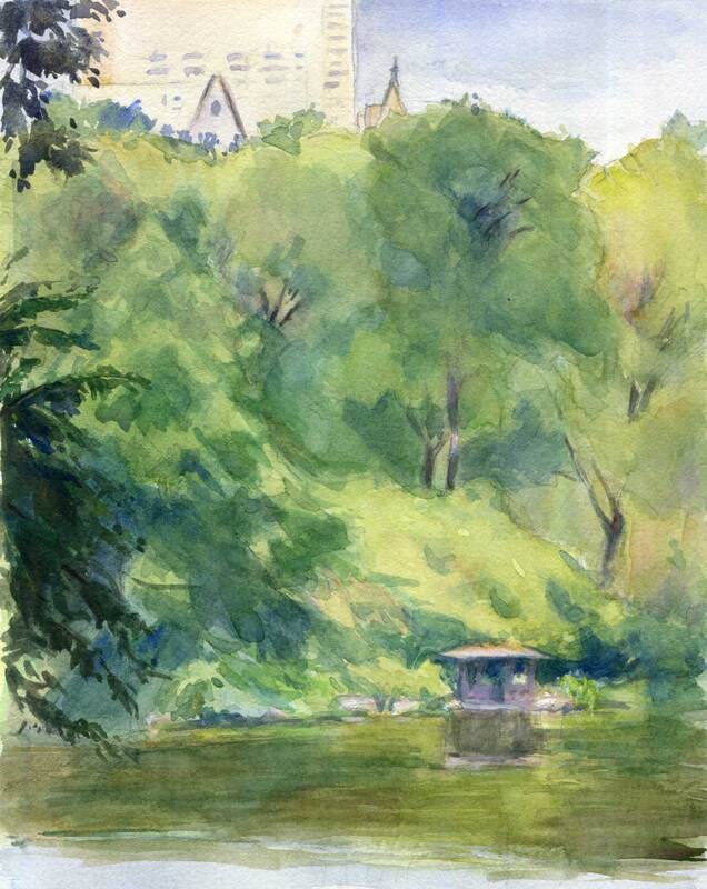
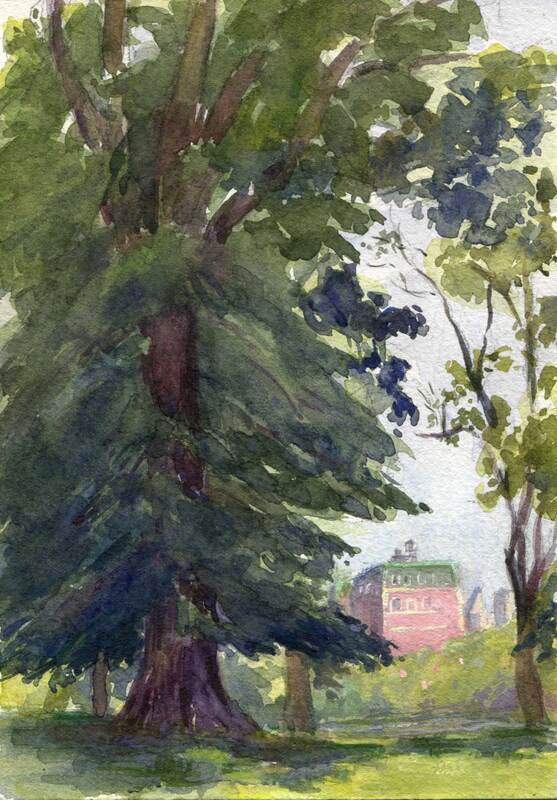
Central Park View, 8x10" Watercolor

Central Park View (above) was my last painting in the landscape class. My dominant compositional value was in the middle (not too dark or too light). The row of trees behind the lake formed the dominant shape. It was a challenge to keep the varied greens and violets from straying out of the middle range, and to maintain that strip of lightness in the building tops and the sky.

Phew, that class kept me on my toes! But the effort, not to mention the mosquitos, heat and humidity-- yes, all of it was so worth it. Now I'm psyched to go out and play with the new concepts, so stay tuned for more landscape fun this summer. Thanks for visiting, see you in the next post!

So? What do you think? I'd love to hear from you ...
Click on the comment section below and add your questions and comments.

SUBSCRIBE
INSTAGRAM

1 Comment

School Days

6/3/2021

0 Comments

 
Artists never stop learning. Never. Well, not if they're interested in the pursuit of excellence, anyway. It's a quest that takes a lifetime of dedication, hard work and contemplation. After all, an artist's calling is to produce magnificent paintings that people will want to look at. And keep looking at. That's the kind of work I want to do.

I've been desperately seeking a watercolor teacher for a while. But it's been tough finding one I can relate to. One who lives in my city. And yes, that's New York City, where you might think they'd be lurking around every corner. Oh well. Instead of taking classes I've watched online tutorials, read how-to books, and just generally taught myself. And for the most part my efforts have paid off.

Except ... sometimes I get a nagging feeling that something's missing. That my work needs just a little extra something to make it really sing. A wow factor, if you will. That's why I jumped at the chance to take a plein air workshop with Sam Adoquei, my teacher from my National Academy days. It was such a privilege to study with him back then, and I'm thoroughly stoked about doing it again. Not only are Sam's paintings exquisite, but he generously and expertly shares his vast knowledge with his students. He's a great teacher, and if anyone can give me a heads up, it's him.

The workshop started this week and help was immediate. First Sam explained the elements of a well-designed composition. During the workshop we'll  be breaking down and practicing those elements one by one. Sam also got me combing over my old work to see how my compositions could be improved. What a relief to get some answers!

Below is a watercolor that I painted last week, before the workshop began. There are things about it I'm pleased with, including the way that the top of the red maple tree is lit up by the sun as if in flame. It was thrilling to witness that miracle of nature on a busy Manhattan street, and my aim was to capture it on paper.

Still, I wasn't totally happy with the result. After Sam's lesson I can clearly see that the overall design of the painting could have been better. For example, the lit and shaded portions of the maple tree are nearly the same size and shape, and even the shaded green area beneath is quite similar. It would have been more interesting to vary these shapes and sizes for a more balanced composition.

That's just one thing I would have done differently. But there are so many things artists need to consider when they compose their paintings. I'll be learning about more of them this summer, and share them with you. I'm psyched!
Picture
Red Maple on Third Avenue

Say something! I'd love to hear from you ...
Click on the comment section below and add your questions and comments.

SUBSCRIBE
INSTAGRAM

0 Comments

Touch of Pink

2/18/2021

2 Comments

 
Mallomars! The chocolate cookie that's so much fun to paint. And since it's cold outside they're in season. And available right now at my local grocery store.

Though what I really wanted was another shot at that pink floral napkin. Yes, I love all the softness of the pinks against the crispy, dark cookies. But I have to confess, it's mainly because I love a good challenge. And for me, painting fabric in watercolor isn't easy. Especially patterned fabric. How come? Let me explain.
Picture
Mallomars No. 3
For Details or to Purchase

Well, one big challenge is in making the folds in the cloth look soft and rounded. Often there's a soft, subtle edge where a fold turns to the light, and a sharper, darker edge on its opposite side. A clean, moist brush will soften an edge, but just how moist is that? And since adding more water to the paint makes it lighter, I need to carefully gauge the ratio of paint to water for controlling lights and darks. All while choosing the right colors. And, as I make all these decisions, it's important to keep the paint moist and fresh, and not let it dry out. So the paint doesn't look blotchy. And the paper surface doesn't get wrecked. And the colors don't get muddy.

But wait, there's more! I also need to suggest the floral pattern, painting gingerly around the white flowers so they stay white. Why suggest? So each flower and leaf is just a little bit soft and hazy, without too much oomph. Otherwise the flowers will take over the whole painting and compete with the cookies for attention. After all, this painting is called "Mallomars, No. 3", and not "Floral Napkin with Mallomars"!

And, with all these different colors in the pattern and the folds and the lights and shadows, and keeping the white flowers white, pant, pant ... the napkin still has to read as a pretty, delicate pink.

Yes, it's a lot for a novice watercolorist! It's one thing to understand all this in theory, and quite another to actually do it. There's only one way to learn how to paint with beautiful, confident brushstrokes: Practice, practice, practice. I'm workin' on it.

I'd love to hear from you!
Click on the comment section below to add your questions and comments.

SUBSCRIBE
INSTAGRAM

2 Comments

Autumn Fruit

11/25/2020

0 Comments

 
I'm a painter, and never intended to write a food blog. But since fruits and vegetables are so beautiful to look at I often wind up using them in my still life paintings. Right now the grocery stores around here are stocked with mandarin oranges and hachiya persimmons, two gorgeous fruits that originated in Asia. Every autumn I look out for them because they make such wonderful subjects to paint.
Picture
Mandarin Oranges, No. 1
For Details or to Purchase

Mandarin oranges are deliciously sweet and come in several varieties. A quick internet search revealed that these particular mandarins are called satsumas. Fortunately for me satsuma oranges are shipped with stems and leaves still attached. This protects the oranges and makes them more fun to paint. ☺️

I purposely tried to keep the edges as wet and soft as I could. My aim was to use sharper edges only where absolutely necessary. So you could tell that I was painting oranges and leaves, and not just puddles of pretty colors. This soft method takes advantage of the flowing, watery nature of the watercolor medium. And is a continual source of learning and experimentation for an artist who started out as an oil painter.
Picture
Hachiya Persimmons in Silver Bowl
For Details or to Purchase

Persimmons also come in varieties. The two most commonly sold in New York City are fuyus and hachiyas. Fuyus are the flat round ones, sweet and ripe while still firm. I painted the other type, hachiya persimmons. Hachiyas have pointed ends like acorns, and need to get good and soft before you can eat them. Otherwise they're quite astringent and can make your mouth pucker, blech!

My persimmons had reached the ripe, delicious stage. I put the lovely orange-red fruits in a silver bowl, and placed them on a patterned fabric to create an interesting reflection.  But I didn't want that beautiful, busy fabric to take over the whole painting. So I muted the patterns by keeping their edges soft. And I upped the contrast, details, and color intensity in the fruit. That's how my luscious persimmons hold your attention and remain as the center of interest.

Thanks for visiting!

I'd love to hear from you!
Click on the comment section below to add your questions and comments. ​

Follow me!
SUBSCRIBE
INSTAGRAM
0 Comments

Pepper Pops!

10/14/2020

0 Comments

 
Red is quite a fiery, flashy color, isn't it? It likes to jump up and down and wave for attention. It monopolizes all eyes in the room. Too many flashy colors in your painting and it could escalate into a brawl. Although I adore them I rarely place such flaming colors so prominently in my paintings. Usually I save them for a few bright accents just to liven things up. That didn't happen this time.

It was full harvest mode at my local farmer's market. Amid all the produce was a dazzling assortment of peppers in yellows, oranges, reds and greens. All these gorgeous colors caught my eye, so I brought a box home to paint in a still life. I arranged some orange and green peppers in a bowl with a few red ones scattered about for a bright color pop. Frankly, my first attempt was not a success. (Hey, it happens. All the time, actually, and thereby lies a tale for another post.)

When I finally got around to the second try the peppers had ripened into a full blazing scarlet. Not my original intention, but what can you do. An artist has to adapt. Anyway, that red was such a rich, ravishing color that I went for it. I'm a sucker for a challenge. But how to make it work with all that heat? I thought that by surrounding the reds with some cool grays and blues it might calm the composition down a bit. And allow the reds to shine. And that it might be fun to contrast them with that one lone green pepper that refused to ripen. 
Picture
Red Peppers in Bowl
For Details or to Purchase

For the next painting I went back to my usual m.o. with a gentler color scheme. And some brilliant color pops. Back at the market I picked up another box of peppers. Orange ones.  This time the red accents were in the leaves of a croton plant sitting by the window. It was a dark, rainy day and I loved the way the soft, cool grays played against the vivid reds and oranges in my peppers and leaves, setting them off nicely. 
Picture
Peppers and Croton Plant
For Details or to Purchase

I'd love to hear from you!
Click on the comment section below to add your questions and comments. ​

​​Follow me!
Instagram   Subscribe
0 Comments
    Julie Painting

    Julie Kessler

    I'm a representational painter enchanted by the unique qualities of watercolor. Sometimes oils, gouache, colored pencils and other media call to me too. I started this blog to share my work and ideas about making art. Sometimes I toss other things into the mix. Such as painters I love, and art books and exhibits that inspire me. Your comments are welcome. I'd love to hear from you! 


    Follow Here!
    Instagram
    Subscribe!

    Recent Posts

    Picture
    Central Park Trees
    Picture
    Central Park Grad
    Picture
    Singer 66 Red Eye

    Categories

    All
    Art History
    Books & Videos
    Boucher
    Central Park
    Cityscapes
    Color
    Colored Pencils
    Composition
    DIY
    Drawing
    Exhibits
    Friskit
    Gouache
    Hispanic Society
    Interiors
    Introduction
    Julie's Drawings
    Julie's Paintings
    Landscape Painting
    Manet
    Metropolitan Museum Of Art
    Oil Paintings
    Pen And Wash
    Portraits
    Sam Adoquei
    Sorolla
    Still Life
    Theo Fried
    Thomas Hart Benton
    Veronese
    Watercolor Pencils
    Watercolors


    www.juliekessler.com
 HOME   GALLERIES   ON PAPER   OIL PAINTINGS  AVAILABLE  ABOUT   CONTACT   BLOG
Follow:  Instagram  Subscribe
www.juliekessler.com  All images © Julie Kessler, all rights reserved