Julie Kessler Fine Art
  • Home
  • Galleries
  • On Paper
  • Oil Paintings
    • Landscapes
    • Still Lifes
  • About
  • Available
  • Contact
  • Blog

Until Then

12/18/2021

0 Comments

 
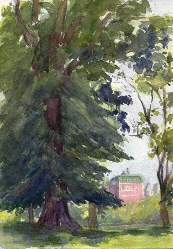
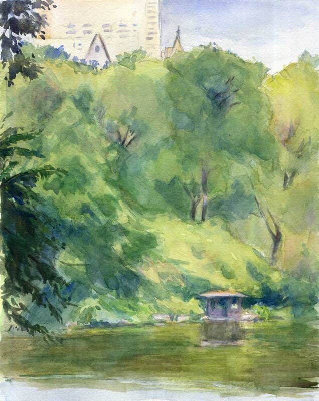
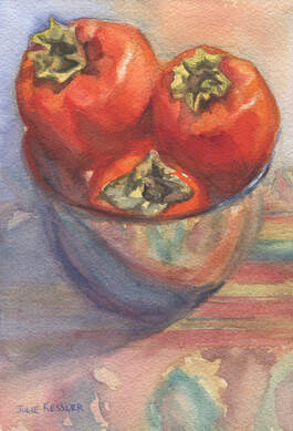
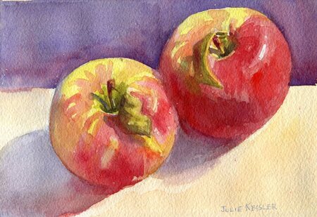
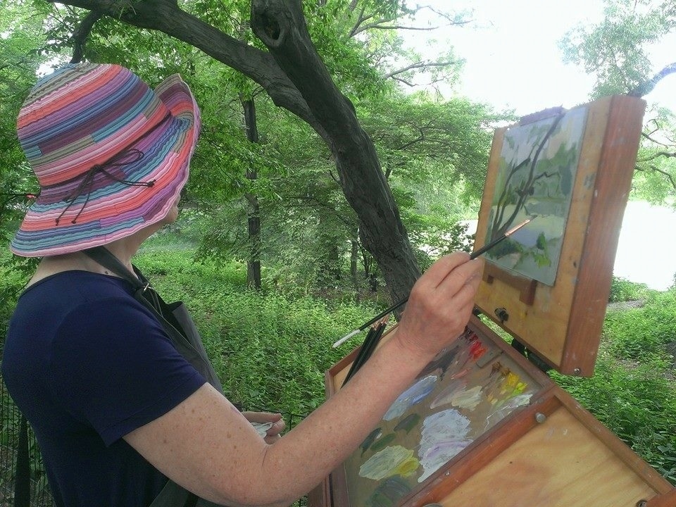
Seems I've been on hiatus from this blog since ... dear me, since August! And it looks as if it's gonna be that way for a bit longer. So I may as well face facts and make it official. Okay, so I'm officially on hiatus until the winds of change blow me back this way again.

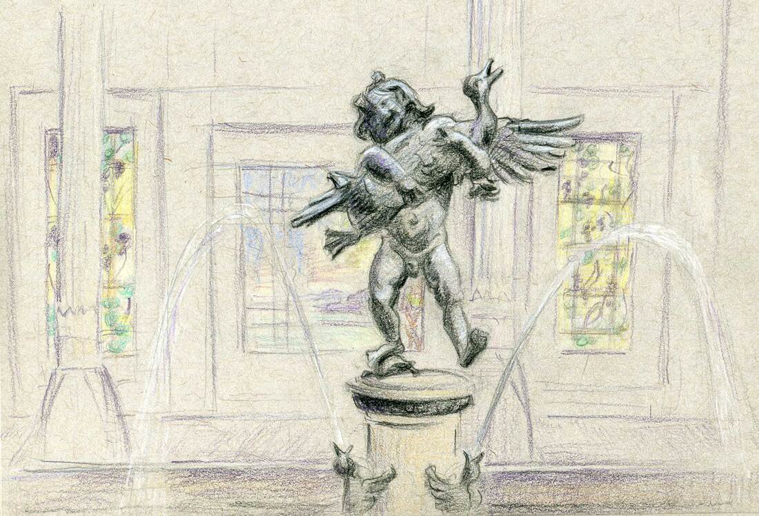
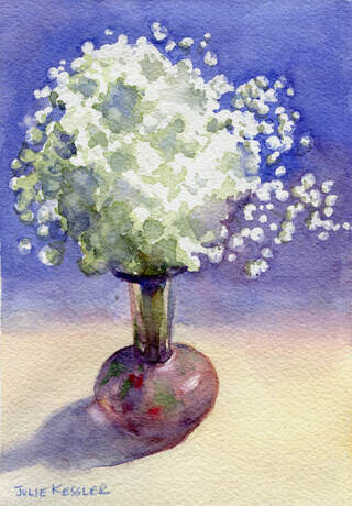
Thanks to everyone who's been following me and my work. I appreciate each and every one of you, and hope to meet you here when I return. Meanwhile, here's a holiday card in watercolor and colored pencil. Plus a little white gouache thrown in for highlights. Have a wonderful holiday, and all the best to you, your kith and kin!
Picture
Lindor Candies

Go ahead and say something. I'd love to hear from you!
Click on the comment section below to add yours.

SUBSCRIBE
INSTAGRAM

0 Comments

Central Park Grad

7/6/2021

1 Comment

 
Ah, tempus fugit, and that wonderful Central Park landscape class I've been taking is now officially over. Luckily I still have a season ticket to al fresco painting in New York City. And time to practice all the great new stuff I learned in the class. But summer marches on, so I hope the weather gremlins behave themselves. Gotta get out there and paint!
Picture
Central Park Tree Looking West, 5x7" Watercolor

Hmmm, does the watercolor above look familiar? Well, if you read my last post you've already seen it. Only it looks slightly different now because during the class my teacher, Sam Adoquei suggested some modifications. Since our focus was on composition, he gave me tips on how to strengthen the design.

For example, I made the dark stately tree in the foreground even darker with a unifying wash. An adjustment that makes the tree less scattered-looking, and amplifies its grandness. But even more significantly, it intensifies the dominant dark value that I was originally going for. (Curious about what "value dominance" means? You can read about it here: All in the Balance.)

Okay, so first an artist grabs your attention with a striking design, and then tries to keep it there for as long as possible. To accomplish the latter Sam recommended that I jazz up the background for my viewers' entertainment as their eyes wander through the painting. A few spicy details were added in the sliver of lake, the row of trees, and that rosy Kenilworth building just beyond the park on Central Park West.
Picture
Central Park View, 8x10" Watercolor

Central Park View (above) was my last painting in the landscape class. My dominant compositional value was in the middle (not too dark or too light). The row of trees behind the lake formed the dominant shape. It was a challenge to keep the varied greens and violets from straying out of the middle range, and to maintain that strip of lightness in the building tops and the sky.

Phew, that class kept me on my toes! But the effort, not to mention the mosquitos, heat and humidity-- yes, all of it was so worth it. Now I'm psyched to go out and play with the new concepts, so stay tuned for more landscape fun this summer. Thanks for visiting, see you in the next post!

So? What do you think? I'd love to hear from you ...
Click on the comment section below and add your questions and comments.

SUBSCRIBE
INSTAGRAM

1 Comment

All in the Balance

6/19/2021

4 Comments

 
If you read my last post you'll know that I'm taking a Central Park landscape class during the month of June. After a year of staying in place it's so liberating to be out and about with other people who love making art as much as I do. And in such a gorgeous setting! Not only that, our teacher, Sam Adoquei is a monumental source of knowledge, heart and skill. I'm thrilled that he's teaching the tools that will make my work stronger. And potentially more beautiful.

For an artist there are a million things to study. In this class my focus has been on the essential rules of composition. After all, no matter how well I paint, or how lovely my brushwork and colors are, if my design stinks then nobody will be interested in my work. A sobering thought. And high motivation to master this fundamental lesson.

Like Mr. McGuire's famous advice in "The Graduate", during the class Sam shined the spotlight on one single word. But in this case that word was BALANCE.

Yes, balance is the secret password to great design. Especially asymmetrical balance created by things that are dissimilar. Here are three simple examples of this principle: If you have a large object in your painting balance it with a few smaller ones. Or if you paint something round and smooth you might balance it with some short sharp lines. Or balance dull colors with a few bright ones. You get the idea. All the very best paintings, both modern and traditional, are based on this concept.

As the class began I spent quite a few days practicing balance with value. In art value is how light or dark things are. In the pencil studies below I used only three values: light, medium and dark. For each study my assignment was to choose one of the three values, using it as the dominant one in roughly 75 percent of the sketch. I placed the other two values in the remaining area, about twenty and five percent respectively. All this while making sure that there was at least one large, dominant shape.

For me this was an easy concept to understand. And like so many things in life it was a bit trickier to execute. I'm glad these sketches were fun to do, because I did a whole lot of them (smile). And I'll probably continue to make quick pencil studies before beginning a painting, even after the class is over. Turns out these little sketches are quite handy for solving big problems before committing to a larger work. 
Picture
Central Park Composition Studies (1), Pencil.
Picture
Central Park Composition Studies (2), Pencil.
Picture
Central Park Composition Studies (3), Pencil.

Picture
Central Park Tree Looking West, 5x7" Watercolor

If you take a look at the second sketch on the first page of pencil sketches above you'll see the study I used as the basis for my watercolor, Central Park Tree Looking West. Let's see if I managed to maintain a sense of balance in the design. Seventy-five percent dark in value? Check. One large dominant shape? Check. And there were several other things to balance too. For instance the tall, stately tree on the left with the smaller, delicate one on the right. And the trees representing the vastness of nature compared with the tiny man-made Central Park West building in the background.

What a great class, right? It's given me so much food for thought as I plan my paintings in the future. Hope you've enjoyed reading about my experience. Please let me know what you think in the comments!

Speak to me! I'd love to hear from you ...
Click on the comment section below and add your questions and comments.

SUBSCRIBE
INSTAGRAM

4 Comments

Metropolitan Sketches

2/25/2021

2 Comments

 
It was one of those weeks. The kind where life happens and not much art work gets done. Although I did find time to flip through some of my sketch books. And reminisce about the good old days when it was easy to take sketching trips for granted.

For me, sketching on location is just plain fun. And since it's fun, it's a painless way to practice and improve my design and drawing skills. It also happens to slow me down for a deeper look at my surroundings, which widens my appreciation of them. All wonderful reasons for regular sketching trips!

In the whole wide world, one of my favorite places to sketch is the Metropolitan Museum of Art. With so many galleries and amazing treasures, it would take a lifetime to draw them all. Of course, right now getting out and about is pretty much on hold. So my sketches have become precious keepsakes, bringing back memories of the days when indoor expeditions were a lot less complicated. I'm looking forward to their return! And I don't suppose I'll ever take them for granted again.

Here are a few of my Metropolitan Museum sketches. Click through the gallery below to see larger images.

I'd love to hear from you!
Click on the comment section below to add your questions and comments.

SUBSCRIBE
INSTAGRAM

2 Comments

Who Do Ya Love?

1/21/2021

2 Comments

 
Picture
Three Forelle Pears
For Details or to Purchase

Like rabbits, skilled watercolorists are proliferating all over the world. Instagram is absolutely teeming with them! It's nothing short of a miracle that we can follow artists from such far flung places as China, India, Japan and Russia, as well as from every corner of my own country, the United States. We're so lucky to live in a time when it's possible to be awed and inspired by these wonderful artists every single day. And without even leaving home.

As you may know, I've only been working in watercolor for a few years now. I'm way more confident than when I first started, but I'm still sifting through the medium's technical demands and unique pictorial possibilities. I'm so humbled by the expertise and brilliance of many contemporary watercolorists. When I see their work I toss my pesky ego aside in order to appreciate and learn. Just like way back in art school, when I planted my easel near the more advanced students so I could watch them paint. I miss those easy days of camaraderie, when we all studied together and encouraged each other. Back when we had the advantage of congregating in the same studio. But one thing we didn't have was the internet. And we never even imagined connecting to a worldwide community of artists online.

So, who are these wonderful watercolorists on Instagram? Well, to get you started here are four that I like to follow: Osamu Shibata, Nina Orlova, Yong Hong Zhong, and Mayumi Taguchi. These are just a few of my favorites, and they're all different from each other. And there are so many more! Who are your favorite watercolor artists? Please tell us in the comments.

While you're checking all the other artists out, please don't forget to visit and follow julie_time. That's me, of course!
Picture
Hot Sauce
For Details or to Purchase

I'd love to hear from you!
Click on the comment section below to add your questions and comments. ​

SUBSCRIBE
INSTAGRAM

2 Comments

Olé!

1/13/2021

0 Comments

 
If you've been following my ramblings for a while you may recall that I belong to a club called the NYC Urban Sketchers. It's the local branch of an international group of artists of all levels, from professionals to total beginners. We get together to sketch at various locations around town, making beautiful friendships and inspiring each other along the way.

In the "before" times (gee, seems so long ago!) the NYC Urban Sketchers gathered in person once or twice a week. Now we continue to meet regularly, except virtually, at a socially safe distance. There's a sketching prompt at each meeting, and by necessity most of us work from photos. However, my own personal preference is to work from observation. So I usually paint an interior scene, or set up a still life. And try to follow the prompt as best I can.

Recently, at our online holiday party, the prompt was to sketch a festive holiday cocktail. Hmmm. That was a tall order, since I seldom have anything resembling an alcoholic drink, let alone such a fancy one. But as it happens I had just unearthed a box from deep within the forgotten recesses of my closet, filled with six adorable shot glasses from the '50s. Each glass featured a pair of flamenco dancers, each in slightly different costumes and poses. And, as my friend with a poetic flair pointed out, they are all dancing together — yet separately. Each pair in their own little glass bubble. A metaphor for our times.
Picture
Olé!
For Details or to Purchase

I tried doing something a little different in this painting. I used hot press paper instead of my usual cold press. Hot press paper is a little less forgiving, and it's harder to go back and correct anything I may have messed up. This approach forces me to make bold, executive decisions with each brushstroke, and then just leave it alone. For better or worse. It may result in a few nicks and bruises, but overall the quality of the paint stays fresh and lively. Such a hard lesson for me to learn! My perfectionist nature shrinks back in horror at the very thought of letting something go if it's not quite right. But in watercolor, as in so many things, the perfect is the enemy of the good. Just gotta be brave, that's all.

I'd love to hear from you!
Click on the comment section below to add your questions and comments. ​

SUBSCRIBE
INSTAGRAM

0 Comments

Autumn Fruit

11/25/2020

0 Comments

 
I'm a painter, and never intended to write a food blog. But since fruits and vegetables are so beautiful to look at I often wind up using them in my still life paintings. Right now the grocery stores around here are stocked with mandarin oranges and hachiya persimmons, two gorgeous fruits that originated in Asia. Every autumn I look out for them because they make such wonderful subjects to paint.
Picture
Mandarin Oranges, No. 1
For Details or to Purchase

Mandarin oranges are deliciously sweet and come in several varieties. A quick internet search revealed that these particular mandarins are called satsumas. Fortunately for me satsuma oranges are shipped with stems and leaves still attached. This protects the oranges and makes them more fun to paint. ☺️

I purposely tried to keep the edges as wet and soft as I could. My aim was to use sharper edges only where absolutely necessary. So you could tell that I was painting oranges and leaves, and not just puddles of pretty colors. This soft method takes advantage of the flowing, watery nature of the watercolor medium. And is a continual source of learning and experimentation for an artist who started out as an oil painter.
Picture
Hachiya Persimmons in Silver Bowl
For Details or to Purchase

Persimmons also come in varieties. The two most commonly sold in New York City are fuyus and hachiyas. Fuyus are the flat round ones, sweet and ripe while still firm. I painted the other type, hachiya persimmons. Hachiyas have pointed ends like acorns, and need to get good and soft before you can eat them. Otherwise they're quite astringent and can make your mouth pucker, blech!

My persimmons had reached the ripe, delicious stage. I put the lovely orange-red fruits in a silver bowl, and placed them on a patterned fabric to create an interesting reflection.  But I didn't want that beautiful, busy fabric to take over the whole painting. So I muted the patterns by keeping their edges soft. And I upped the contrast, details, and color intensity in the fruit. That's how my luscious persimmons hold your attention and remain as the center of interest.

Thanks for visiting!

I'd love to hear from you!
Click on the comment section below to add your questions and comments. ​

Follow me!
SUBSCRIBE
INSTAGRAM
0 Comments

Two Honeycrisps

11/11/2020

2 Comments

 
My goodness it's been an exciting week! Between the national election and family obligations I've had the attention span of an anxious gnat. And I'm ready for two weeks of being thoroughly spoiled. Nevertheless I managed to complete a small, quick watercolor this very morning. Saved by the bell.

I bought some honeycrisps at this week's farmers market. My favorite apples, crisp and sweet. I picked out these two apples to paint because they looked so beautiful with their leaves still attached.

Thanks for visiting!
Picture
Two Honeycrisps
For Details or to Purchase

I'd love to hear from you!
Click on the comment section below to add your questions and comments. ​

Follow me!
Instagram    Subscribe!
2 Comments

Baby Love

11/3/2020

1 Comment

 
My mother loves bright, beautiful multi-colored bouquets of flowers. And who doesn't? Lately I've been bringing flowers home to her quite frequently. Just that little drop of nature seems to lift our spirits while so many of our usual activities are on hold. Besides, she enjoys painting flowers. It runs in the family.

Recently I bought a gigantic bunch of blossoms that crowded even our biggest, baddest vase. I thinned it out by removing the tiny white baby's breath that florists use to pad out their arrangements. Maybe I'm alone in this, but I've never thought that baby's breath did much for bouquets anyway. So I put the little flowers into their own mini bud vase and casually set them in front of a blue screen. And there they magically transformed into a twinkly, star-like vision that became the inspiration for a painting.

Only thing is, how could I possibly paint a nice blue watercolor wash around all those teeny tiny little white flowers without going mad? Then I remembered that some watercolorists use liquid masking fluid (also called friskit) for just such a purpose. They brush the frisket onto paper, and wherever it lands it resists the watercolor paint. And abracadabra, it reserves the white of the paper. So cool.

However, I once used friskit with disastrous results, probably because it was way past it's sell-by date. Instead of rubbing off nicely when I was finished, it turned a nasty gray and stuck to the paper. Not only that, but it ruined the brush too. Ugh, I wasn't looking forward to a repeat performance. Nevertheless I persevered. This time with a brand new bottle of Schmincke liquid friskit that came highly recommended. And it worked like a charm. Thank goodness.

In the the language of flowers baby's breath is a symbol of everlasting love, pureness, and innocence. No wonder they're often found in wedding bouquets. Here's my homage to their celestial beauty. You can click on the image to see it larger, to purchase, or to contact me about the painting. Thanks for visiting!
Picture
Baby's Breath
For Details or to Purchase

I'd love to hear from you!
Click on the comment section below to add your questions and comments. ​

Follow me!
Instagram   Subscribe
1 Comment

In the Bedroom

10/21/2020

6 Comments

 
The bedroom. The place where people sleep. In western culture it's an intimate room often tucked away in a private area of the house. Artists have been painting them for ages. But in my search for images I found mostly erotic and religious works that happen to take place there. It was much harder to find paintings that were all about the bedrooms themselves. Until I got to the 19th century. So what changed?
Picture
Vincent van Gogh, The Bedroom, 1888, Van Gogh Museum, Amsterdam
Well, prior to the 19th century western painters made a living by making art for the one percent of their day. And what did the wealthy want? Mostly portraits of themselves, and art with religious, mythological and historical themes. Along with the occasional naughty picture commissioned for their own unofficial and secret enjoyment.
Picture
Edouard Vuillard, Child Playing: Annette Roussel in a Front of a Wooden Chair, c1900, Art Institute of Chicago
But then came the industrial age, and with it the growth of the middle class. Artists found new buyers who were interested in a whole 'nother type of art. Basically their new clients wanted nice paintings to hang on their walls, and were uninterested in large formal paintings with a religious or complicated  message.
Picture
Carl Larsson, Papa's Room, c. 1890-1899, Nationalmuseum, Stockholm
Technology brought major changes for artists too. Photography, a new invention, became a  popular source for portraits. New tools, like collapsible paint tubes and portable easels catapulted painters out of the studio and into the great outdoors. Discoveries of bright new pigments opened their eyes to the brilliant world of light and color. Freed from former constraints, artists began experimenting with their shiny new toys. And looking to their own, personal experiences and immediate surroundings for inspiration.
Picture
John Singer Sargent, Bedroom Window, c. 1909-1911
Why was I interested in bedroom paintings in the first place? Well, as you know there's a pandemic on right now. I was looking for inspiration without leaving the house. This couldn't be the first time artists encountered rainy days or pandemics. I wanted to see how they made the best of being stuck inside. 

Do you paint interiors? Have you got a favorite artist who did? Or a favorite painting of one? Do tell us in the comment section below.
Picture
Julie Kessler, Bedroom, Watercolor, 8x10 in

I'd love to hear from you!
Click on the comment section below to add your questions and comments. ​

Follow me!
Facebook   Instagram  Subscribe
6 Comments
<<Previous
    Julie Painting

    Julie Kessler

    I'm a representational painter enchanted by the unique qualities of watercolor. Sometimes oils, gouache, colored pencils and other media call to me too. I started this blog to share my work and ideas about making art. Sometimes I toss other things into the mix. Such as painters I love, and art books and exhibits that inspire me. Your comments are welcome. I'd love to hear from you! 


    Follow Here!
    Instagram
    Subscribe!

    Recent Posts

    Picture
    Central Park Trees
    Picture
    Central Park Grad
    Picture
    Singer 66 Red Eye

    Categories

    All
    Art History
    Books & Videos
    Boucher
    Central Park
    Cityscapes
    Color
    Colored Pencils
    Composition
    DIY
    Drawing
    Exhibits
    Friskit
    Gouache
    Hispanic Society
    Interiors
    Introduction
    Julie's Drawings
    Julie's Paintings
    Landscape Painting
    Manet
    Metropolitan Museum Of Art
    Oil Paintings
    Pen And Wash
    Portraits
    Sam Adoquei
    Sorolla
    Still Life
    Theo Fried
    Thomas Hart Benton
    Veronese
    Watercolor Pencils
    Watercolors


    www.juliekessler.com
 HOME   GALLERIES   ON PAPER   OIL PAINTINGS  AVAILABLE  ABOUT   CONTACT   BLOG
Follow:  Instagram  Subscribe
www.juliekessler.com  All images © Julie Kessler, all rights reserved