Julie Kessler Fine Art
  • Home
  • Galleries
  • On Paper
  • Oil Paintings
    • Landscapes
    • Still Lifes
  • About
  • Available
  • Contact
  • Blog

Report from Central Park

7/29/2021

0 Comments

 
Picture
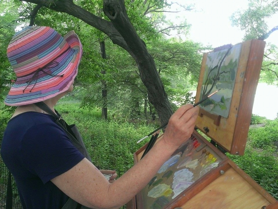
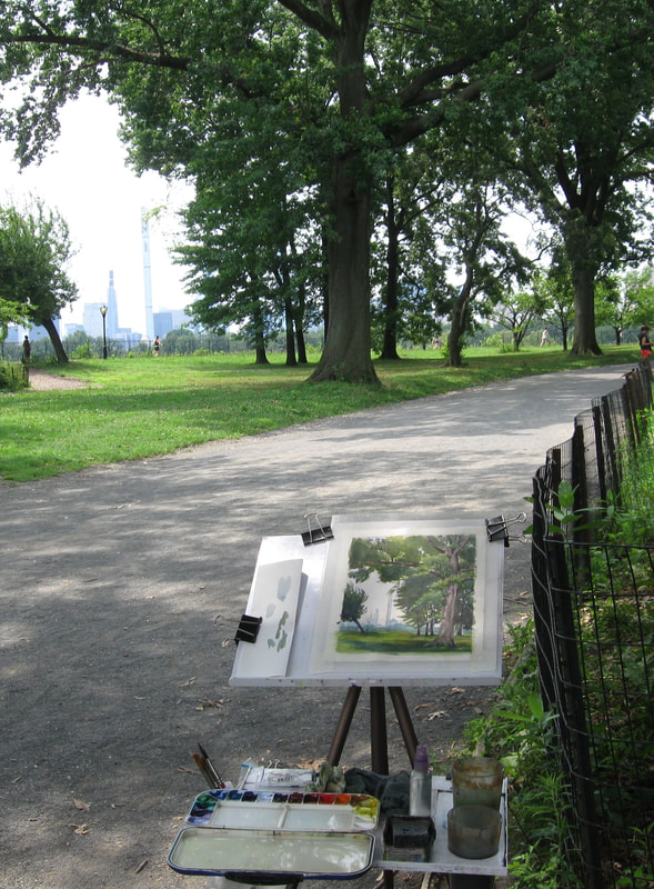
All summer long I've been trekking over to Central Park in the mornings with a spring in my step and a granny cart full of art supplies. Since I'm a typical car-less New Yorker I haul just enough stuff for a single day of painting. Even with a trimmed down kit my cart is a lifesaver. The photo shows only a portion of all the paraphernalia that I schlep each day.

Tools are very personal and every artist has their own preferences. This season a Meeden tripod field easel has been my constant companion. Sure, it's all plastic and it's not the steadiest. On the plus side it weighs practically nothing and it sets up and dismantles in a flash. To counter its annoying tendency to tip over in a gust of wind I hang my water bottle on the tripod and it stays upright (usually). A couple of strong magnets hold my palette securely to the shelf. And I had an extra well cut out because I want/need two water cups. One is for cleaning my brushes. The second holds clean water to keep my colors nice and bright.
Picture
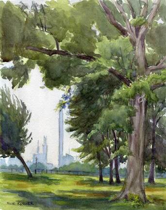
Central Park Skyline
For Details or To Purchase

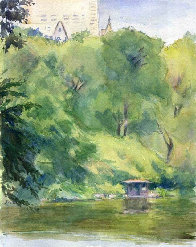
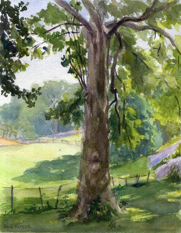
This week I set up my easel just north of the Central Park Reservoir. When I looked through the trees facing south I was astonished at how changed the skyline was from the way I remembered it. In recent  years these unbelievably tall, skinny "pencil" towers have proliferated across midtown, defying gravity and poking holes in the clouds. I chose a view that depicts just one of them. I wanted to show that the  immense vastness of nature dwarfs any man-made tower. No matter how high the architect has the audacity to build.

Picture
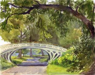
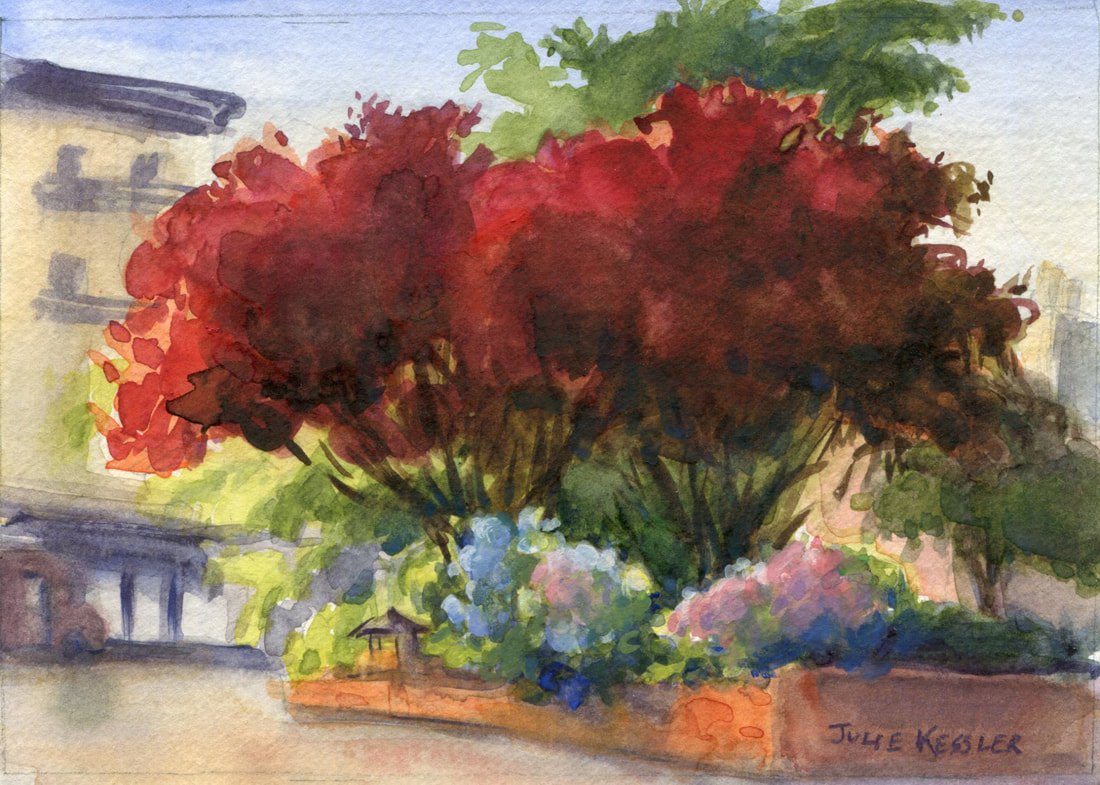
Central Park Bridge No. 28 (Gothic)
For Details or To Purchase

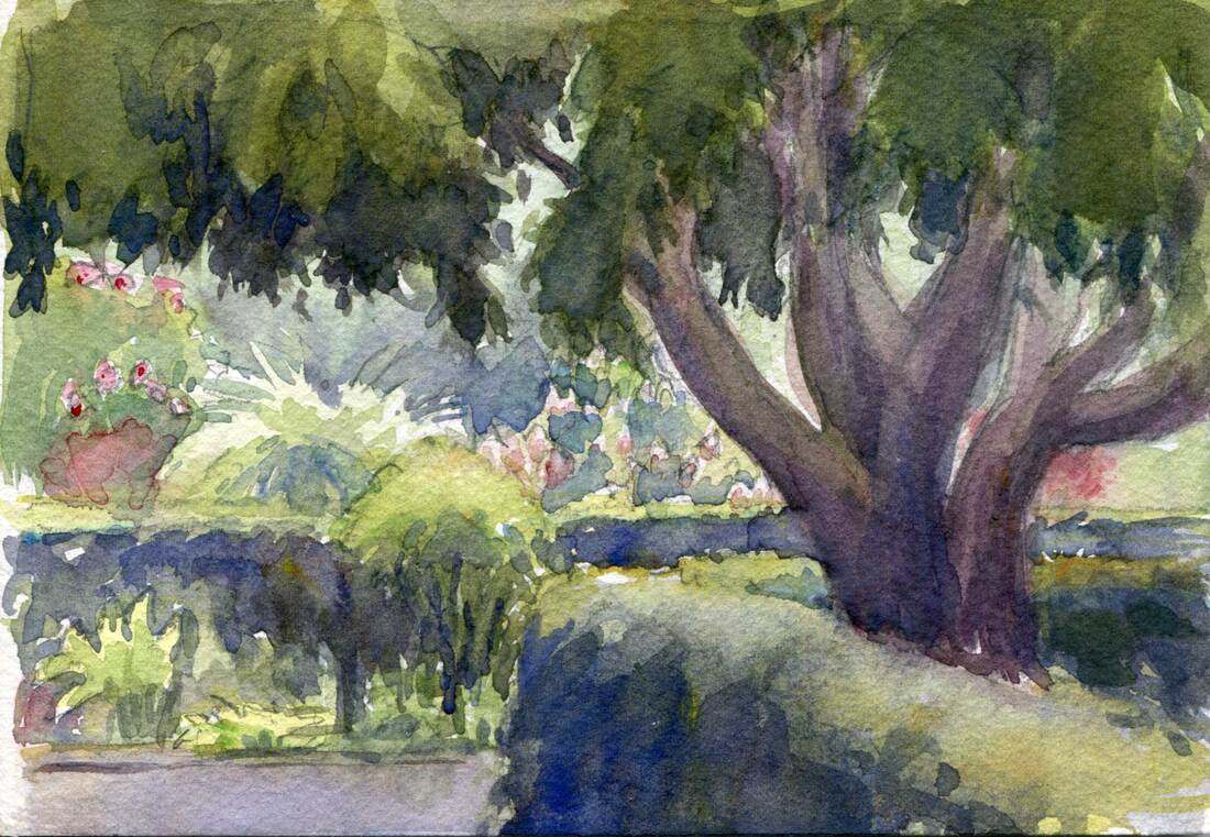
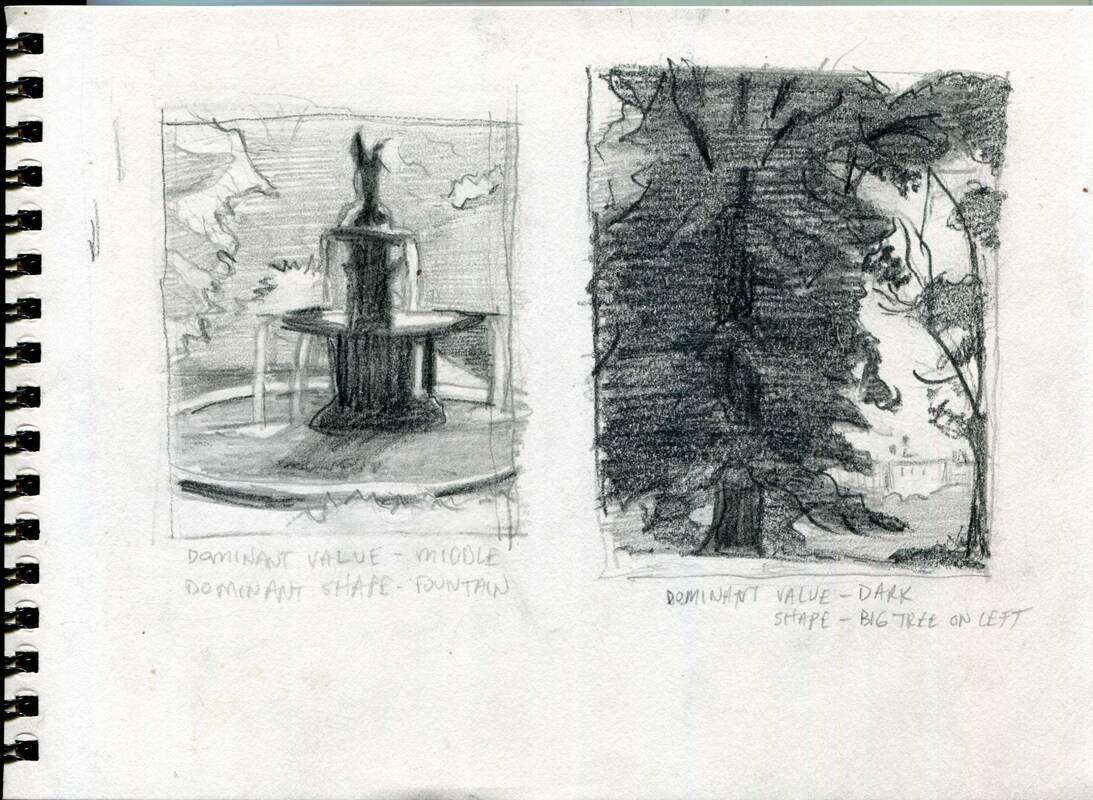
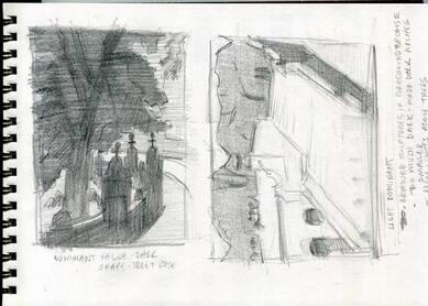
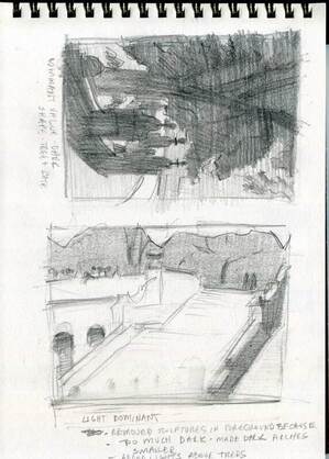
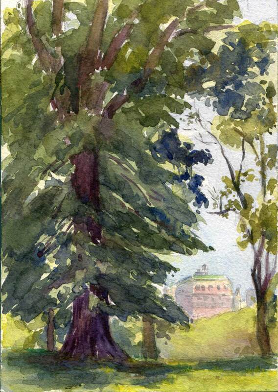
I started my second painting just a few steps away on the bridle path looking west at Bridge No. 28, nicknamed the "Gothic". Because I was working so close to the road quite a few passersby stopped to chat. One woman told me that the wonderful old tree that bends over in the foreground is a white mulberry -- and has been designated one of the "Great Trees" of Central Park. I included that tree in my watercolor because I love the way it echoes the arc of the bridge. Her story only deepened my appreciation of its grandeur. Another visitor said he loves Bridge No. 28 so much that he wants to "adopt" it and restore it back to its original glory. After looking at it closely for awhile I thought that he had a brilliant idea.

SUBCRIBE
INSTAGRAM

Questions? Comments? I'd love to hear from you!
Click on the comment section below to add yours.

0 Comments

Central Park Trees

7/21/2021

0 Comments

 
Welcome to high summer in New York City, when the steamy hot days come fast and furious. To beat the heat and maintain a disciplined work routine I get myself outside and painting first thing most mornings. And as early as possible, so I don't get too involved doing something else instead. (For instance those pesky chores and errands that seem to pop up like wack-a-moles.) It's true that I've never been much of a morning person but it's amazing what you can get used to if you haven't got a better choice.
Picture
Central Park Conservancy, Watercolor, 5x7 inches

One recent gray Saturday morning I met up with my pals, the New York City Urban Sketchers at the magnificent Central Park Conservancy Garden. It was our first real live outing since the pandemic, so it was an extra special treat to say hello to everyone and be in their company.

Because I was with my friends I only had a short time to complete my watercolor. So I kept it small and simple. Of course I love the lily pond and the Burnett Fountain, and all the colorful flowers in that exquisite formal garden. But on that day it was the elegant dancing trunk of the magnolia tree that called to my brush.
Picture
London Plane at North Meadow Baseball Field, Central Park
For Details or to Purchase

On another morning I chose a very different area of Central Park to work in. I'd like to tell you that I'd been planning on painting this beautiful London plane tree. And that I had passed by and admired it many times. But the bare naked truth is much more practical and banal. Because it was a wicked hot and humid day, and I knew I'd need plenty of drinking water to get through it. So I headed over to the North Meadow Recreation Center. It's an easy walk from my home and ...they have a restroom. And since Central Park has beautiful views in any direction you turn, I decided to find one right there. In the shade!

Find one I did. First I was attracted to all the interesting knobs and bumps and branches on the London plane tree. And then to the violet and mauve rock formation that's echoed by another outcropping in the background. And then I saw the fence that winds its way around the baseball field until it reaches the dusty diamond. I was hooked.

Okay, so I didn't plan to paint this view. But I'm so glad it was right there.

 Got something to say? I'd love to hear from you!
Click on the comment section below and add your questions and comments.

SUBSCRIBE
INSTAGRAM

0 Comments

Central Park Grad

7/6/2021

1 Comment

 
Ah, tempus fugit, and that wonderful Central Park landscape class I've been taking is now officially over. Luckily I still have a season ticket to al fresco painting in New York City. And time to practice all the great new stuff I learned in the class. But summer marches on, so I hope the weather gremlins behave themselves. Gotta get out there and paint!
Picture
Central Park Tree Looking West, 5x7" Watercolor

Hmmm, does the watercolor above look familiar? Well, if you read my last post you've already seen it. Only it looks slightly different now because during the class my teacher, Sam Adoquei suggested some modifications. Since our focus was on composition, he gave me tips on how to strengthen the design.

For example, I made the dark stately tree in the foreground even darker with a unifying wash. An adjustment that makes the tree less scattered-looking, and amplifies its grandness. But even more significantly, it intensifies the dominant dark value that I was originally going for. (Curious about what "value dominance" means? You can read about it here: All in the Balance.)

Okay, so first an artist grabs your attention with a striking design, and then tries to keep it there for as long as possible. To accomplish the latter Sam recommended that I jazz up the background for my viewers' entertainment as their eyes wander through the painting. A few spicy details were added in the sliver of lake, the row of trees, and that rosy Kenilworth building just beyond the park on Central Park West.
Picture
Central Park View, 8x10" Watercolor

Central Park View (above) was my last painting in the landscape class. My dominant compositional value was in the middle (not too dark or too light). The row of trees behind the lake formed the dominant shape. It was a challenge to keep the varied greens and violets from straying out of the middle range, and to maintain that strip of lightness in the building tops and the sky.

Phew, that class kept me on my toes! But the effort, not to mention the mosquitos, heat and humidity-- yes, all of it was so worth it. Now I'm psyched to go out and play with the new concepts, so stay tuned for more landscape fun this summer. Thanks for visiting, see you in the next post!

So? What do you think? I'd love to hear from you ...
Click on the comment section below and add your questions and comments.

SUBSCRIBE
INSTAGRAM

1 Comment

All in the Balance

6/19/2021

4 Comments

 
If you read my last post you'll know that I'm taking a Central Park landscape class during the month of June. After a year of staying in place it's so liberating to be out and about with other people who love making art as much as I do. And in such a gorgeous setting! Not only that, our teacher, Sam Adoquei is a monumental source of knowledge, heart and skill. I'm thrilled that he's teaching the tools that will make my work stronger. And potentially more beautiful.

For an artist there are a million things to study. In this class my focus has been on the essential rules of composition. After all, no matter how well I paint, or how lovely my brushwork and colors are, if my design stinks then nobody will be interested in my work. A sobering thought. And high motivation to master this fundamental lesson.

Like Mr. McGuire's famous advice in "The Graduate", during the class Sam shined the spotlight on one single word. But in this case that word was BALANCE.

Yes, balance is the secret password to great design. Especially asymmetrical balance created by things that are dissimilar. Here are three simple examples of this principle: If you have a large object in your painting balance it with a few smaller ones. Or if you paint something round and smooth you might balance it with some short sharp lines. Or balance dull colors with a few bright ones. You get the idea. All the very best paintings, both modern and traditional, are based on this concept.

As the class began I spent quite a few days practicing balance with value. In art value is how light or dark things are. In the pencil studies below I used only three values: light, medium and dark. For each study my assignment was to choose one of the three values, using it as the dominant one in roughly 75 percent of the sketch. I placed the other two values in the remaining area, about twenty and five percent respectively. All this while making sure that there was at least one large, dominant shape.

For me this was an easy concept to understand. And like so many things in life it was a bit trickier to execute. I'm glad these sketches were fun to do, because I did a whole lot of them (smile). And I'll probably continue to make quick pencil studies before beginning a painting, even after the class is over. Turns out these little sketches are quite handy for solving big problems before committing to a larger work. 
Picture
Central Park Composition Studies (1), Pencil.
Picture
Central Park Composition Studies (2), Pencil.
Picture
Central Park Composition Studies (3), Pencil.

Picture
Central Park Tree Looking West, 5x7" Watercolor

If you take a look at the second sketch on the first page of pencil sketches above you'll see the study I used as the basis for my watercolor, Central Park Tree Looking West. Let's see if I managed to maintain a sense of balance in the design. Seventy-five percent dark in value? Check. One large dominant shape? Check. And there were several other things to balance too. For instance the tall, stately tree on the left with the smaller, delicate one on the right. And the trees representing the vastness of nature compared with the tiny man-made Central Park West building in the background.

What a great class, right? It's given me so much food for thought as I plan my paintings in the future. Hope you've enjoyed reading about my experience. Please let me know what you think in the comments!

Speak to me! I'd love to hear from you ...
Click on the comment section below and add your questions and comments.

SUBSCRIBE
INSTAGRAM

4 Comments

Summer Sketches

10/27/2020

2 Comments

 
There was a tussle in the studio this week. Between me and my painting of a lovely red cyclamen plant. No matter what I did the painting just wouldn't come out right. Even after I made pencil studies of the tricky parts and then tried again. And again. It was a good fight but finally I'd had enough. Win some lose some. So why am I telling you this? Because if you're following my blog there's a good chance you're interested in the life of a painter. And let me tell you, there are humbling moments to spare. But they're nothing to get excited or discouraged about. No, I just do my best and move on to the next, and try to learn from the experience. Each and every painting is another step toward mastery. Even if it's a turkey.

But that left me without a new painting to post. Fortunately I found three sketches in my Pandemic Summer of 2020 Stash that had somehow never made it onto the blog. And why was that? Because I was trying to grow as an artist and had been exploring new techniques. And my experiments didn't turn out exactly as I had hoped for and imagined. But really, what does it matter? So what if they've got a few flaws, they're still mementos of an extraordinary summer of my life. My life that just whizzes by.

As you might expect during an epidemic, I didn't wander far from home for these sketches. The first two were within a few blocks of my NYC apartment. The third was on a hot, sunny afternoon in Central Park's Conservancy Garden. I didn't get to paint outdoors as much as I do most summers, but I didn't spend the entire season indoors either. Here's the proof.
Picture
Red Maples & Hydrangeas, Watercolor with Gouache, 5x7 in
Picture
93rd & 1st, Watercolor with Gouache, 5x7 in
Picture
Central Park - Conservancy Garden, Watercolor with Gouache, 8x10 in

I'd love to hear from you!
Click on the comment section below to add your questions and comments. ​

Follow me!
Instagram   Subscribe
2 Comments
    Julie Painting

    Julie Kessler

    I'm a representational painter enchanted by the unique qualities of watercolor. Sometimes oils, gouache, colored pencils and other media call to me too. I started this blog to share my work and ideas about making art. Sometimes I toss other things into the mix. Such as painters I love, and art books and exhibits that inspire me. Your comments are welcome. I'd love to hear from you! 


    Follow Here!
    Instagram
    Subscribe!

    Recent Posts

    Picture
    Central Park Trees
    Picture
    Central Park Grad
    Picture
    Singer 66 Red Eye

    Categories

    All
    Art History
    Books & Videos
    Boucher
    Central Park
    Cityscapes
    Color
    Colored Pencils
    Composition
    DIY
    Drawing
    Exhibits
    Friskit
    Gouache
    Hispanic Society
    Interiors
    Introduction
    Julie's Drawings
    Julie's Paintings
    Landscape Painting
    Manet
    Metropolitan Museum Of Art
    Oil Paintings
    Pen And Wash
    Portraits
    Sam Adoquei
    Sorolla
    Still Life
    Theo Fried
    Thomas Hart Benton
    Veronese
    Watercolor Pencils
    Watercolors


    www.juliekessler.com
 HOME   GALLERIES   ON PAPER   OIL PAINTINGS  AVAILABLE  ABOUT   CONTACT   BLOG
Follow:  Instagram  Subscribe
www.juliekessler.com  All images © Julie Kessler, all rights reserved