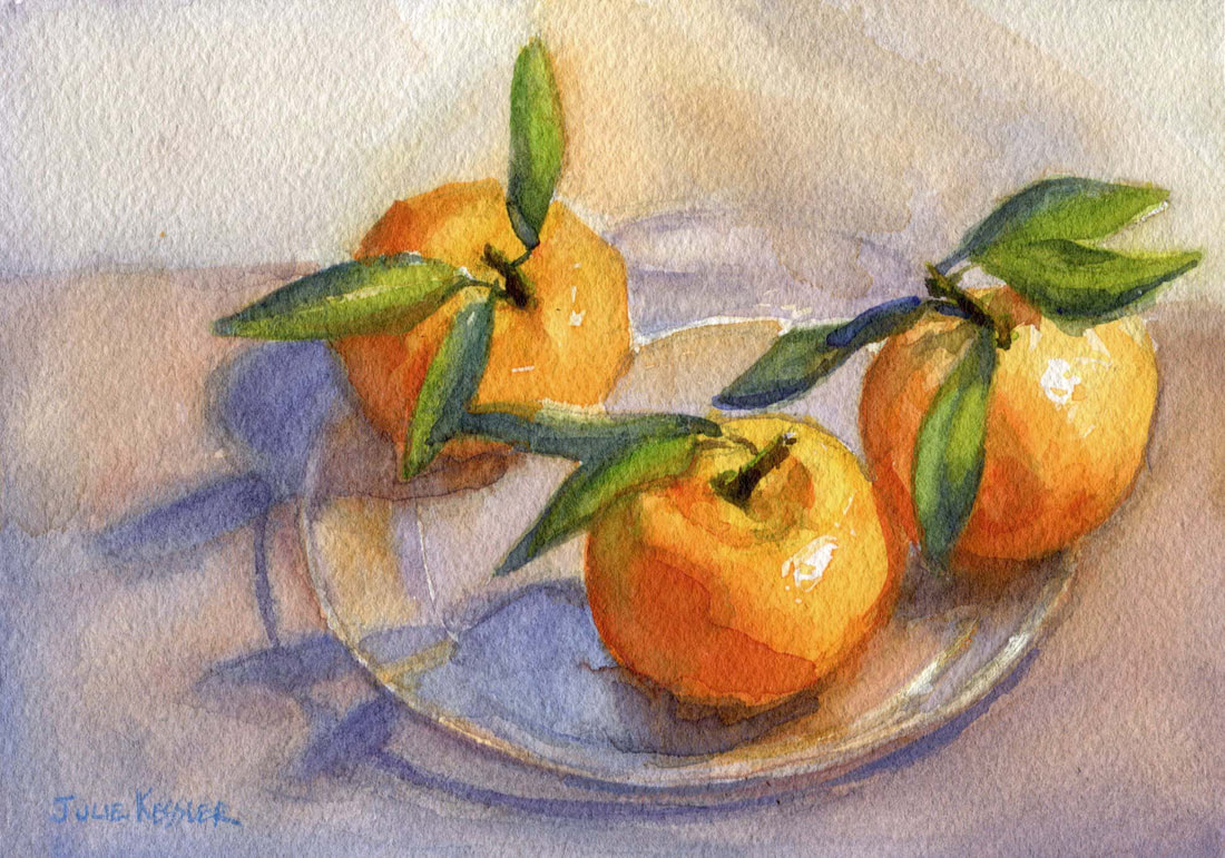
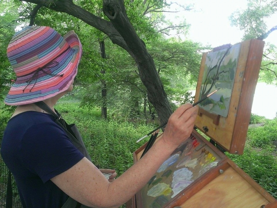
Today it reached a balmy high of 68°F. One more auspicious sign that spring is on its way in my corner of the world. Before you know it it'll be time to paint outdoors again, yay! It's what I dream about all during the nippy winter months.
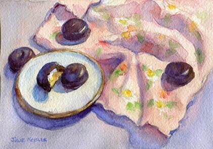
But spring isn't quite here yet. So I'm still painting still lifes indoors with stuff I find around the house. And that's no hardship at all. Because it's actually fun to paint still lifes.
Especially because I'm still punching my way out of a habit in my painting practice. When I'm in deep concentration I sometimes forget to use enough water in my paint mixtures. Enough water to let the paint flow easily over the paper. If I forget, the sizing of the paper gets ever so slightly beat up. And the work loses just a bit of it's clear brightness.
I think I'll put a sign over my easel that says: "It's WATER-color! Don't Forget the WATER!"
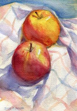
Two Gala Apples
All in a day's work, as I teach myself to master the watercolor medium.
I'm happy to knock this lesson into my coconut while I'm still working indoors. In comfort. Without the distraction of the glaring sun, inquisitive onlookers, the occasional wild animal, and biting insects. And wondering where the nearest bathroom is.
I'm happy to knock this lesson into my coconut while I'm still working indoors. In comfort. Without the distraction of the glaring sun, inquisitive onlookers, the occasional wild animal, and biting insects. And wondering where the nearest bathroom is.

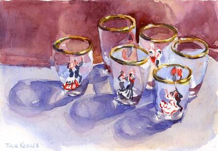
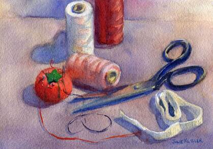
Scissors and Thread

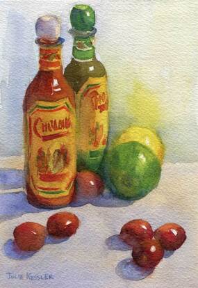
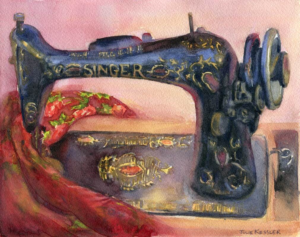
Hot Sauce
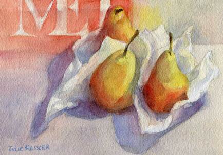
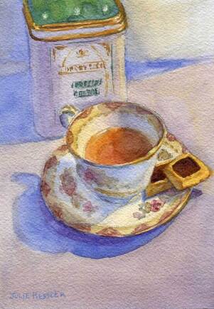
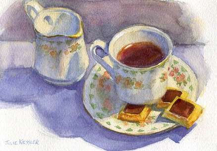
Today I'm featuring three very domestic, indoor watercolors. The painting of two apples is a new one. You may have seen the other two before, because I pulled them up from the archives. Hope you enjoy them, and thanks for visiting!
Say something! I'd love to hear from you ...
Click on the comment section below to add your questions and comments.
Click on the comment section below to add your questions and comments.