Sometimes words fail me. This is one of those times. Maybe because of all the street noise in the wee hours that kept waking me up last night. Not for the first time. Sure, it's exciting to live in New York, the city that never sleeps. But the brain could actually use a few zzz's once in a while. Just to keep it functioning in the word department. This goes even for New Yorkers.
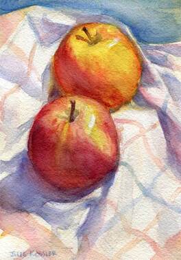
Fortunately I managed to finish a new watercolor painting of a few Granny Smith apples sitting on a wooden cutting board with a paring knife. Next to a much needed cup of coffee. And which I whimsically titled "Pie Day". A name that occurred to me before my brain went dead. And since a picture is worth a thousand words perhaps you'll forgive me just this once if I let the painting speak for itself.
Fortunately I managed to finish a new watercolor painting of a few Granny Smith apples sitting on a wooden cutting board with a paring knife. Next to a much needed cup of coffee. And which I whimsically titled "Pie Day". A name that occurred to me before my brain went dead. And since a picture is worth a thousand words perhaps you'll forgive me just this once if I let the painting speak for itself.
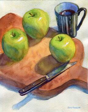
Pie Day
Of course if you have any questions about the painting I'd be happy to answer them. Tomorrow.
I'd love to hear from you ...
Click on the comment section below to add your questions and comments.
Click on the comment section below to add your questions and comments.