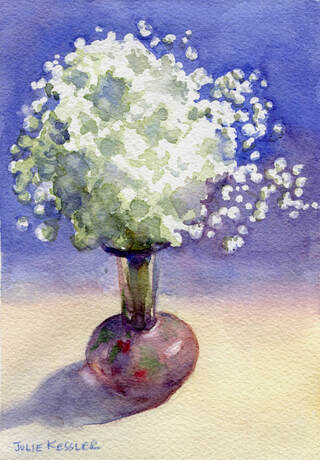
My sister asked me two excellent questions today that made me stop and think. The first one was: How do you get the water in your paintings to look like water?
Hmmm. I've never given this question a whole lot of thought. At least in any specific, scientifically-minded way. After all, I'm an artist, not a scientist. Truth is, I really just paint water like I paint anything else. That is, I merely observe whatever shapes and colors are right there in front of me. And I try to render them as faithfully as my pigments and skill level allow.
For example, as I painted Mums in a Bud Vase (below) I could see that the flowers had lots of crispy edges and the colors were clear and intense. The stems beneath them had softer edges and the colors were muted in comparison. This was because the glass vase formed a translucent layer in front of the stems and enveloped them in haze. An additional soupy layer was created when the stems dipped down into the water. So the stems appeared even softer and fainter there.
But wait, why do the stems seem to bend as they enter the water? Well, if I remember my physics correctly, light is a wave of energy that travels through many materials, including air and space. It can also pass through glass and water. But glass and water are denser than air, so the waves slow down as they pass through them. Slowing down makes the light waves change direction. Straight objects look as if they bend as they hit the water. Or they can seem to break and move over slightly. Or something like that. As I said, I'm not a scientist.
Okay, so I carefully painted the flowers and stems according to what I actually observed. I also included the line where the water starts in the vase. In the context of flowers and vases I think the viewer can easily tell that there's water involved!
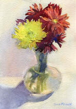
Mums in Bud Vase
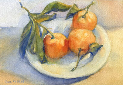
Here's another great question from my inquisitive sister: Are the shadows of the oranges in your painting really purple? Or do you just choose to paint them that color?
This was a much easier question to answer! Because I always paint colors as I observe them, to the best of my ability. That's how I learned to paint way back in art school, and it's the approach that appeals to me most. I don't feel the need to make any colors up! Nature itself is way more colorful and beautiful than we usually take any notice of. For me painting is a kind of homage to nature. As well as a way of slowing down the pace of life and appreciating the beauty that surrounds us.
In short, the shadows really were a purple-ish blue color in Mandarin Oranges, No. 2 (below). For the most part, that's how I painted them. I had placed the oranges in a transparent dish on top of a soft lavender cloth. The light shining on the table gave the cloth a warm orange-ish pink glow. The shadows of the oranges echo the lavender color. And if you look closely you can see that they also reflect the orange/red color of the fruit.
When I set up this still life I was enchanted by the dance of the leaves and how all the colors seemed to sing. I tried my best to convey my appreciation of these things to the viewer.
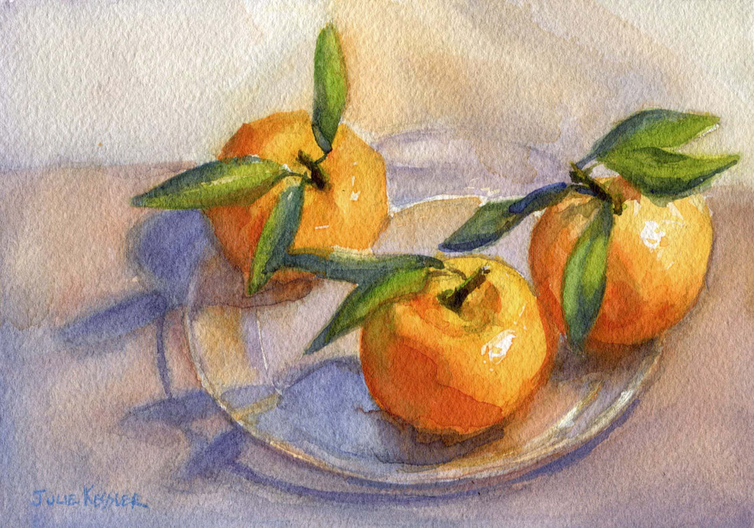
Mandarin Oranges, No. 2
Thanks so much for your questions, Sis!
So, are you curious about how I work too? Go ahead and let me know in the comments. You might just inspire me to answer your question in a post! Thanks for visiting.
So, are you curious about how I work too? Go ahead and let me know in the comments. You might just inspire me to answer your question in a post! Thanks for visiting.
I'd love to hear from you!
Click on the comment section below to add your questions and comments.
Click on the comment section below to add your questions and comments.
Follow me!